PURCELL CASE STUDY
PURCELL CASE STUDY
Gamifying an Inhaler App
Gamifying an Inhaler App
PURCELL CASE STUDY
Gamifying an Inhaler App
Overview
Purcell is an inhaler app designed to help asthmatic patients manage their symptoms and improve their lung health. This project involved creating a gamification concept to encourage good medication usage habits, exercises and access to health stats.
Purcell is an inhaler app designed to help asthmatic patients manage their symptoms and improve their lung health. This project involved creating a gamification concept to encourage good medication usage habits, exercises and access to health stats.
Team: 3 UX/UI Designers
Team: 3 UX/UI Designers
My Role: UX/UI Designer
My Role: UX/UI Designer
Duration: 8 weeks (January-March 2024)
Duration: 8 weeks (January-March 2024)
Product Type: Health Mobile App
Product Type: Health Mobile App
Tools: Figma, Figjam
Tools: Figma, Figjam
Introduction
Problem
Problem
Medication Adherence: Patients with asthma often rely solely on their reliever inhaler to manage their symptoms
Medication Adherence: Patients with asthma often rely solely on their reliever inhaler to manage their symptoms
Incorrect Inhaler Usage: Over 70% of asthmatic patients use their inhaler incorrectly
Incorrect Inhaler Usage: Over 70% of asthmatic patients use their inhaler incorrectly
Traditional concept: Many medical apps have basic features and therefore fail to engage users effectively, resulting in low usage
Traditional concept: Many medical apps have basic features and therefore fail to engage users effectively, resulting in low usage
Healthcare Support: Most users seek guidance from healthcare professionals rather than apps due to limited support and trust with apps
Healthcare Support: Most users seek guidance from healthcare professionals rather than apps due to limited support and trust with apps
Research Phase
Secondary Research
In the first few meetings with the client, our goal was to familiarise ourselves with the existing flows and understand the client's needs and requirements. We then conducted secondary research and analysis to understand users' challenges when using medical devices and apps. Due to time constraints, we decided to focus on studies that provide data about asthma and how current apps support users.
Our research revealed the following:
Define Phase
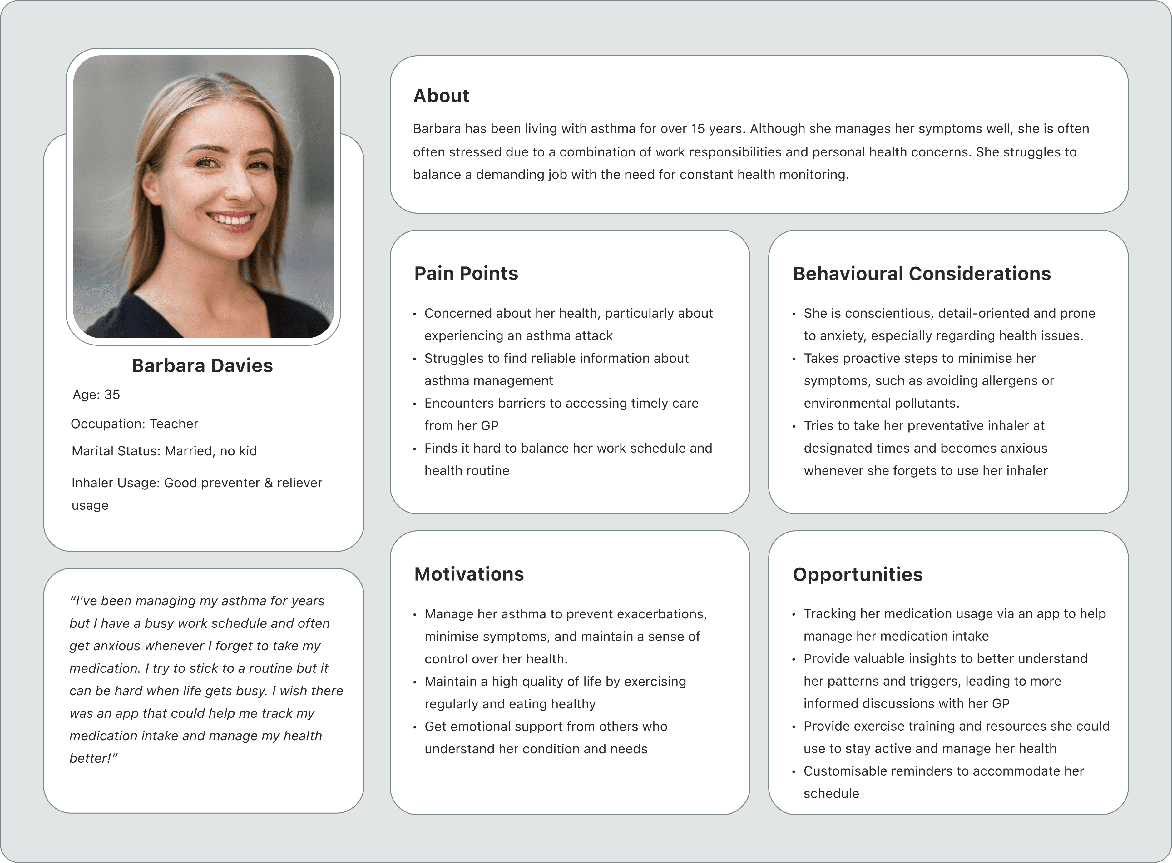
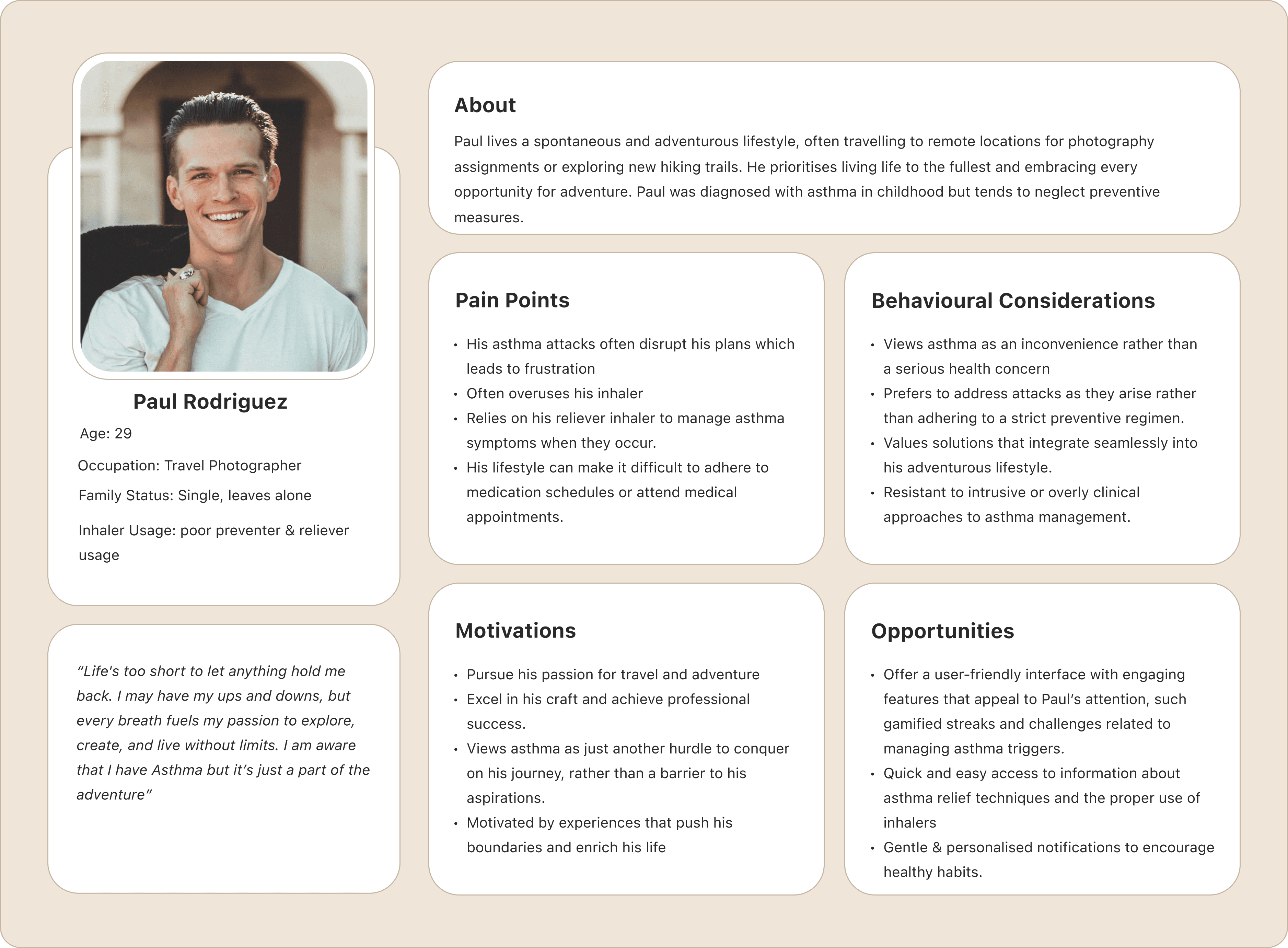
Personas
After gaining a better understanding of medical apps and users’ needs, we created two personas based on their medication adherence. The first persona represents a compliant user who is highly anxious about their condition, while the second persona represents a non-compliant user who is mainly interested in managing symptoms when an asthma attack occurs. These two personas are on opposite ends of the spectrum but helped us gain a better perspective into the different types of patients who would use the app.
Compliant User
Compliant User
Non-Compliant User
Non-Compliant User

Solution
Solution
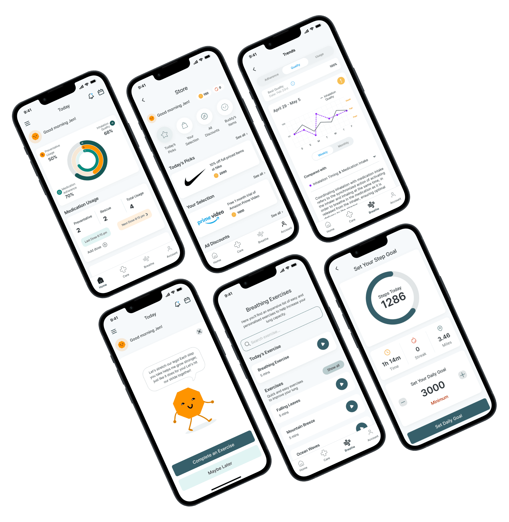
We introduced the concept of a virtual companion to foster an emotional connection with the application and mitigate any apprehensions associated with medical apps. We also developed an inhaler training, introduced personalised goal setting, exercises to improve lung capacity and trend screens to help users stay on track of their progress.
We introduced the concept of a virtual companion to foster an emotional connection with the application and mitigate any apprehensions associated with medical apps. We also developed an inhaler training, introduced personalised goal setting, exercises to improve lung capacity and trend screens to help users stay on track of their progress.
Design Process
Design Process
Prototype
Prototype

Download PDF
Download PDF
Download PDF

Comparative & Competitive Analysis
Our secondary research provided valuable insights into the challenges faced by users. We decided to conduct further research to look at solutions offered by other health apps and analyse their strengths and weaknesses. I also looked into gamified elements that have proven to be successful within health apps. To achieve this, we carried out a comparative and competitive analysis:
Sketches
Sketches
Due to time constraints, we decided to only design sketches and move on to creating high fidelity mockups once approved by the client:
Due to time constraints, we decided to only design sketches and move on to creating high fidelity mockups once approved by the client:
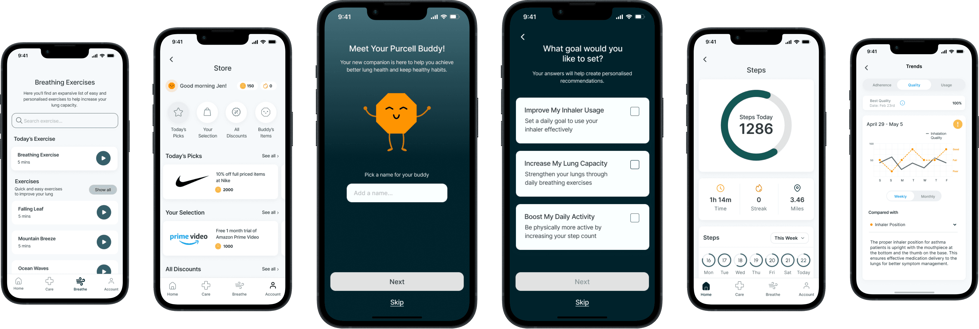
High-Fidelity Mockups
Our sketches gave us a better idea of the visuals and content of each screen. Using the style guide provided by the client, we brought those sketches to life:
Comparative Analysis
Comparative Analysis

Competitive Analysis
Competitive Analysis
Competitive Analysis

HMW’s
After considering the challenges, we used HMW questions to determine our priorities:
After considering the challenges, we used HMW questions to determine our priorities:
How might we educate patients to use their inhalers correctly?
How might we allow patients to easily access their health data?
How might we show progress?
How might we gamify the app to increase engagement?
How might we educate patients to use their inhalers correctly?
How might we allow patients to easily access their health data?
How might we show progress?
How might we gamify the app to increase engagement?
Ideation Phase
The HMW questions helped us to narrow down our solutions and prioritise the most important issues. After brainstorming multiple ideas and having conversations with the client, we came up with the following solutions:
The HMW questions helped narrow down our solutions and prioritise the most important issues. After brainstorming multiple ideas and having conversations with the client, we came up with the following solutions:
Interactive Inhaler Training: Prompt users to go through an inhaler training during the onboarding process, which can be skipped if needed
Virtual Companion: Introduce an avatar, which can be customised to create a more personal experience for the user
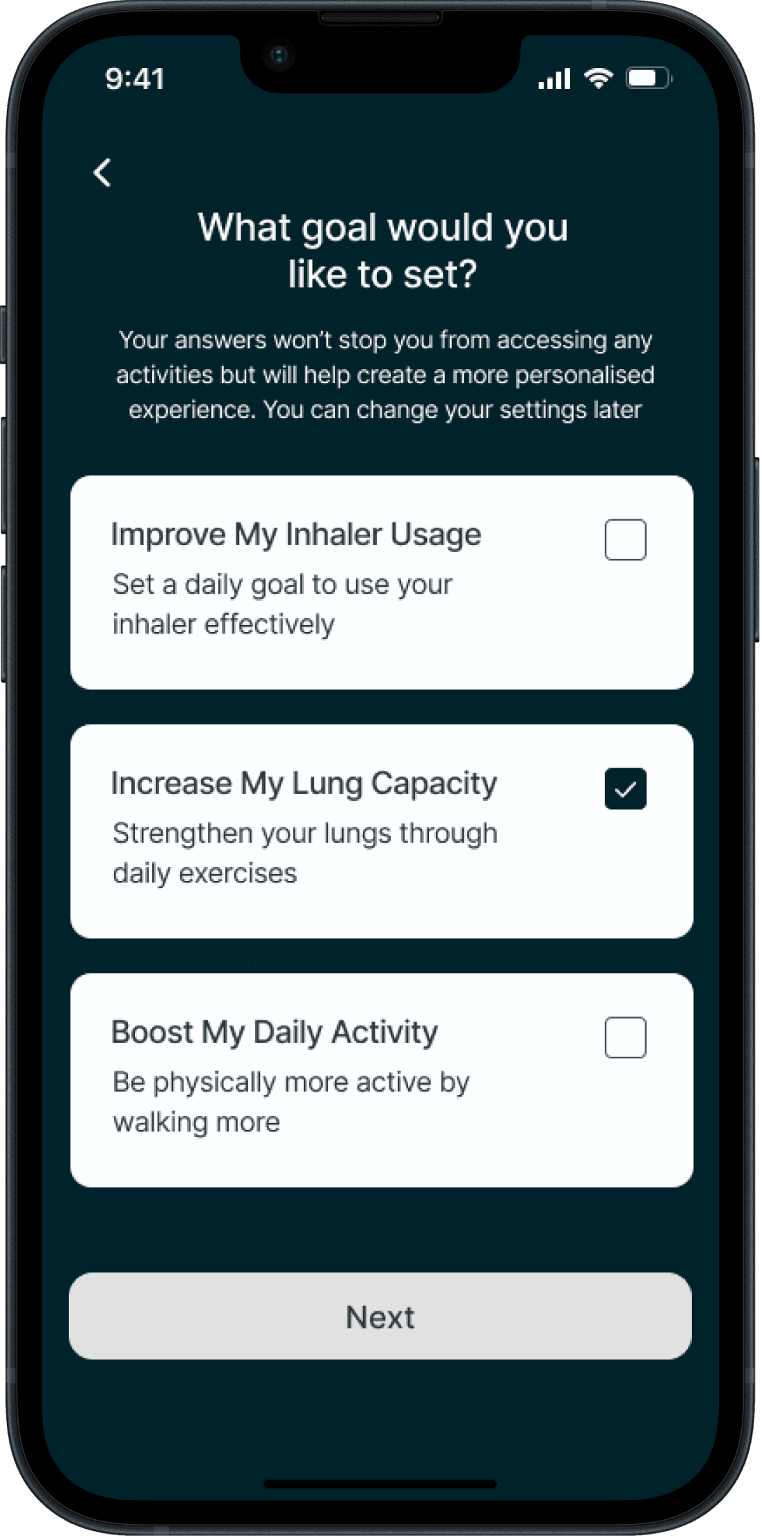
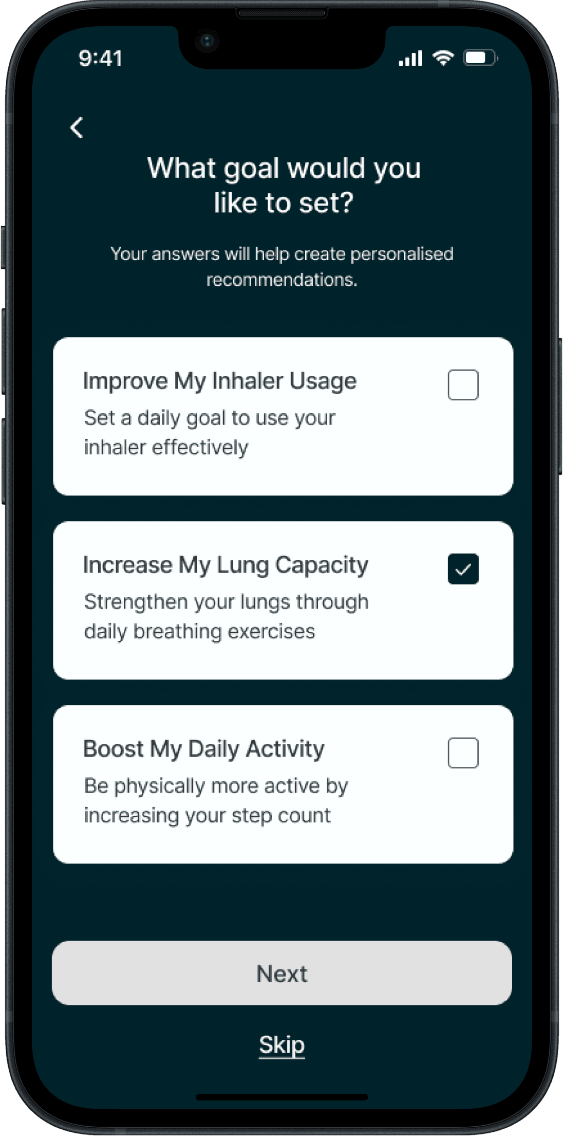
Personalised Goal Settings: Users can set goals and receive recommendations based on their lung profile as well as set reminders to help them stay on top of their routines called “Missions”
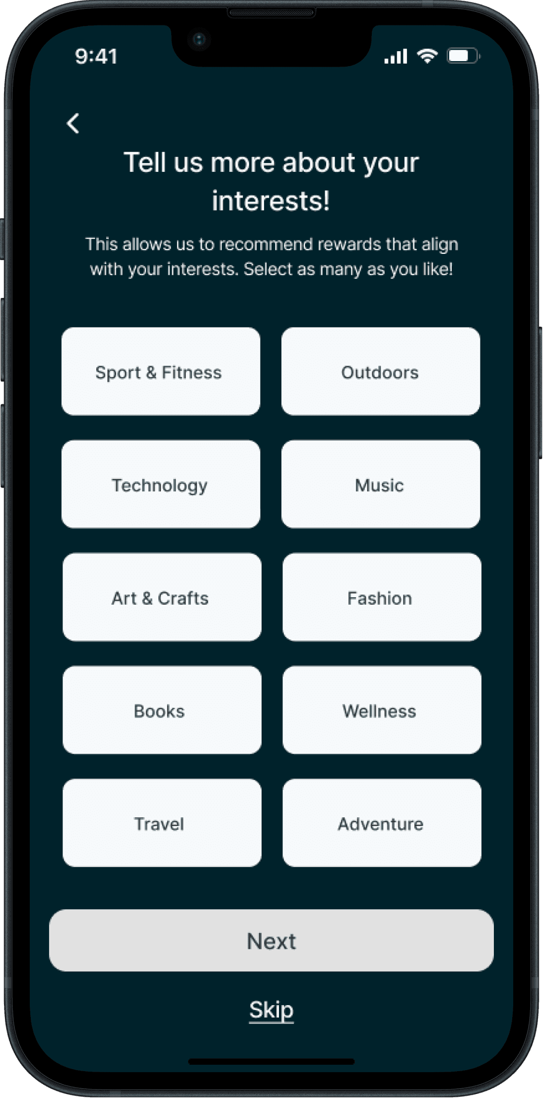
Scoring & Rewards System: By fulfilling their "Missions," users are rewarded with currency within the app, which can be exchanged for both tangible and digital incentives
Leaderboard: Designed to create a sense of community while still keeping users’ privacy intact thanks to the avatar personalisation
Progress Tracking: Create additional screens to help users view and track their progress
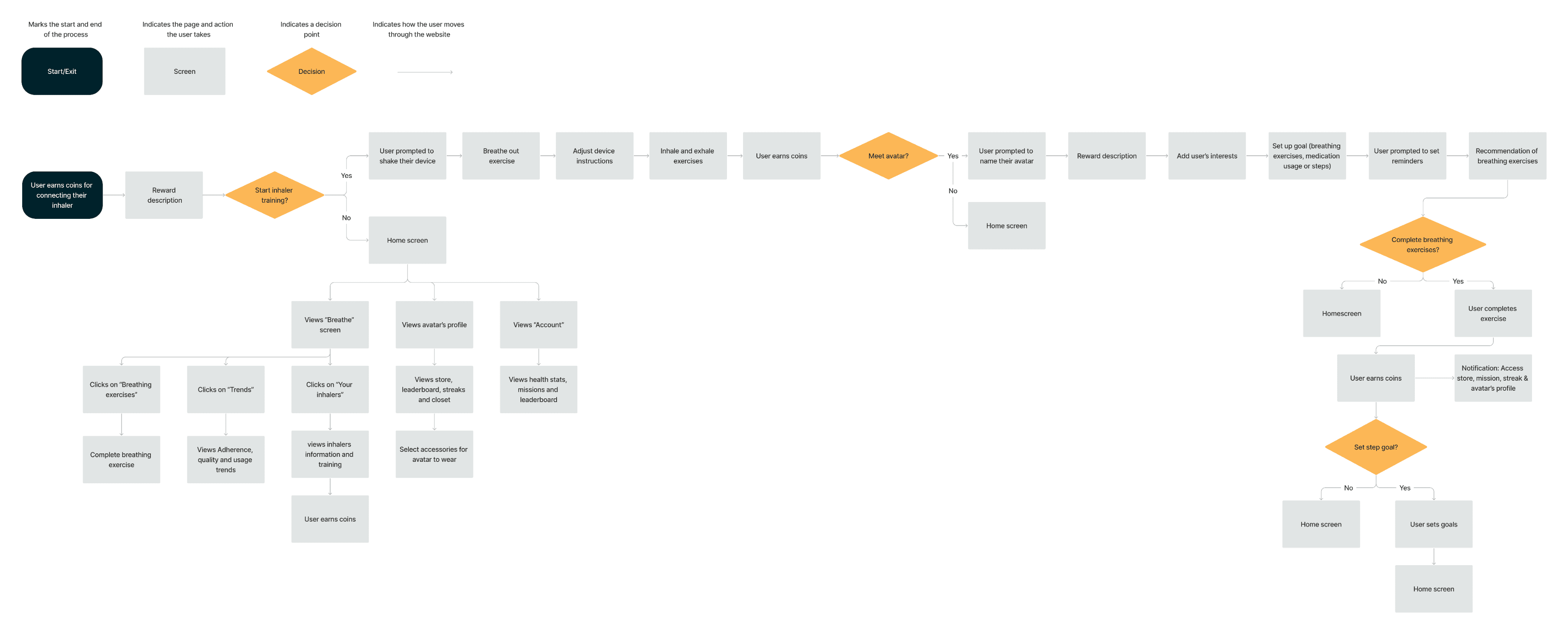
User Flow
We divided the tasks among us, with each designer handling specific user flows. I focused on the avatar’s introduction, goal setting and exercise commendation. We then combined them into a user flow that included all the following red routes:
Onboarding (Inhaler Training, Avatar’s introduction & Goal Setting
Exercise Recommendations
Avatar’s Profile
Inhaler Flow
Trend Flow
Account Flow

View Sketches
View Full Design
View Full Design
Prototype & Test Phases
Prototype
We developed a prototype and conducted a round of usability testing with six users. Based on our discussion with the client, the testers were a combination of asthmatic and non-asthmatic users. The objective of these tests was to ensure that the design and flows were intuitive. Here were our findings and iterations:
BEFORE
BEFORE
AFTER
AFTER
INHALER TRAINING
INHALER TRAINING
FINAL PROTOTYPE
FINAL PROTOTYPE
AFTER
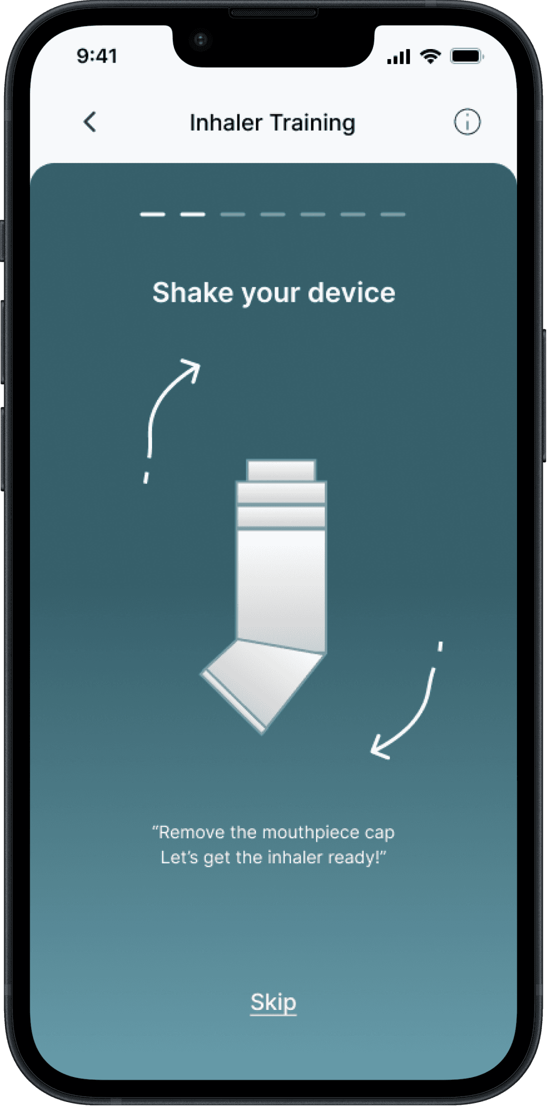
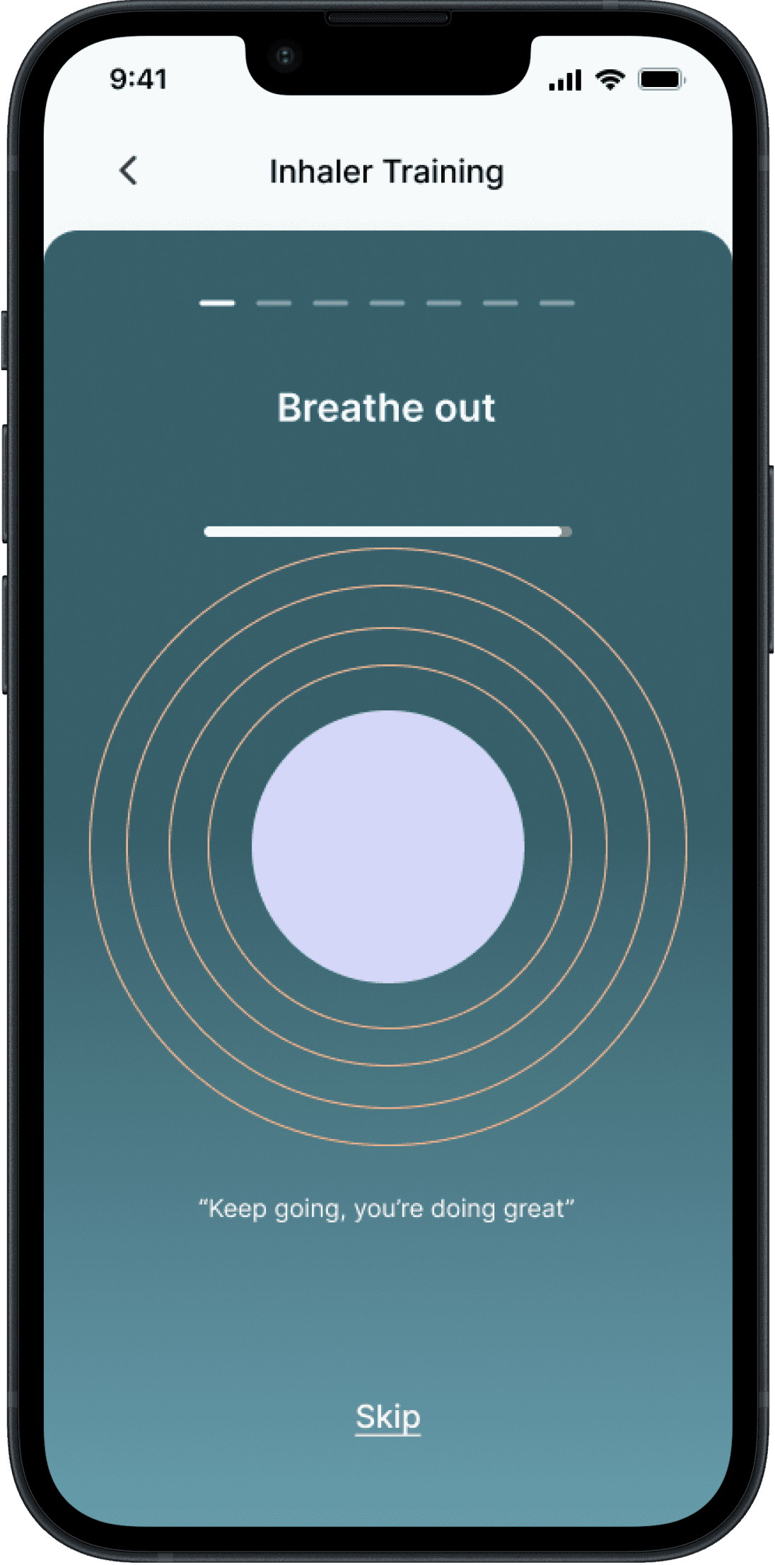
Iteration:
We moved the inhaler instruction to be before the breathe-out exercise
Iteration:
We moved the inhaler instruction to be before the breathe-out exercise
Finding:
The steps for inhaler training needed to be rearranged so that users could shake their inhaler before breathing out
Finding:
The steps for inhaler training needed to be rearranged so that users could shake their inhaler before breathing out
Finding:
The steps for inhaler training needed to be rearranged so that users could shake their inhaler before breathing out
BEFORE
GOAL SETTING SCREENS
GOAL SETTING SCREENS
AFTER
Iteration:
We shortened the texts to ensure they were all concise and easy to understand
Iteration:
We shortened the texts to ensure they were all concise and easy to understand
Finding:
Users found the texts lengthy and didn’t have time to read and understand them all
Finding:
Users found the texts lengthy and didn’t have time to read and understand them all
Finding:
Users found the texts lengthy and didn’t have time to read and understand them all
BEFORE
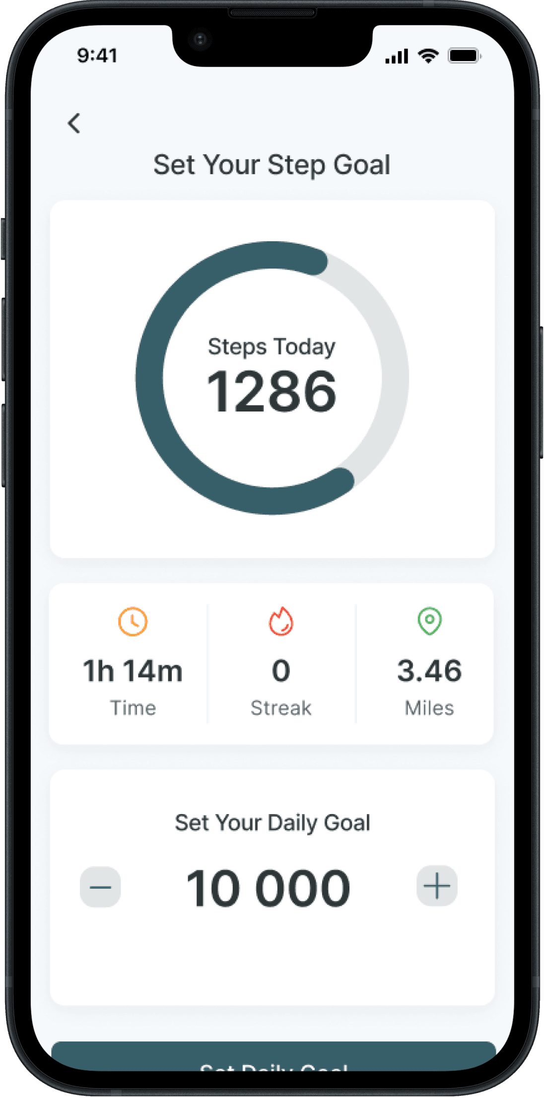
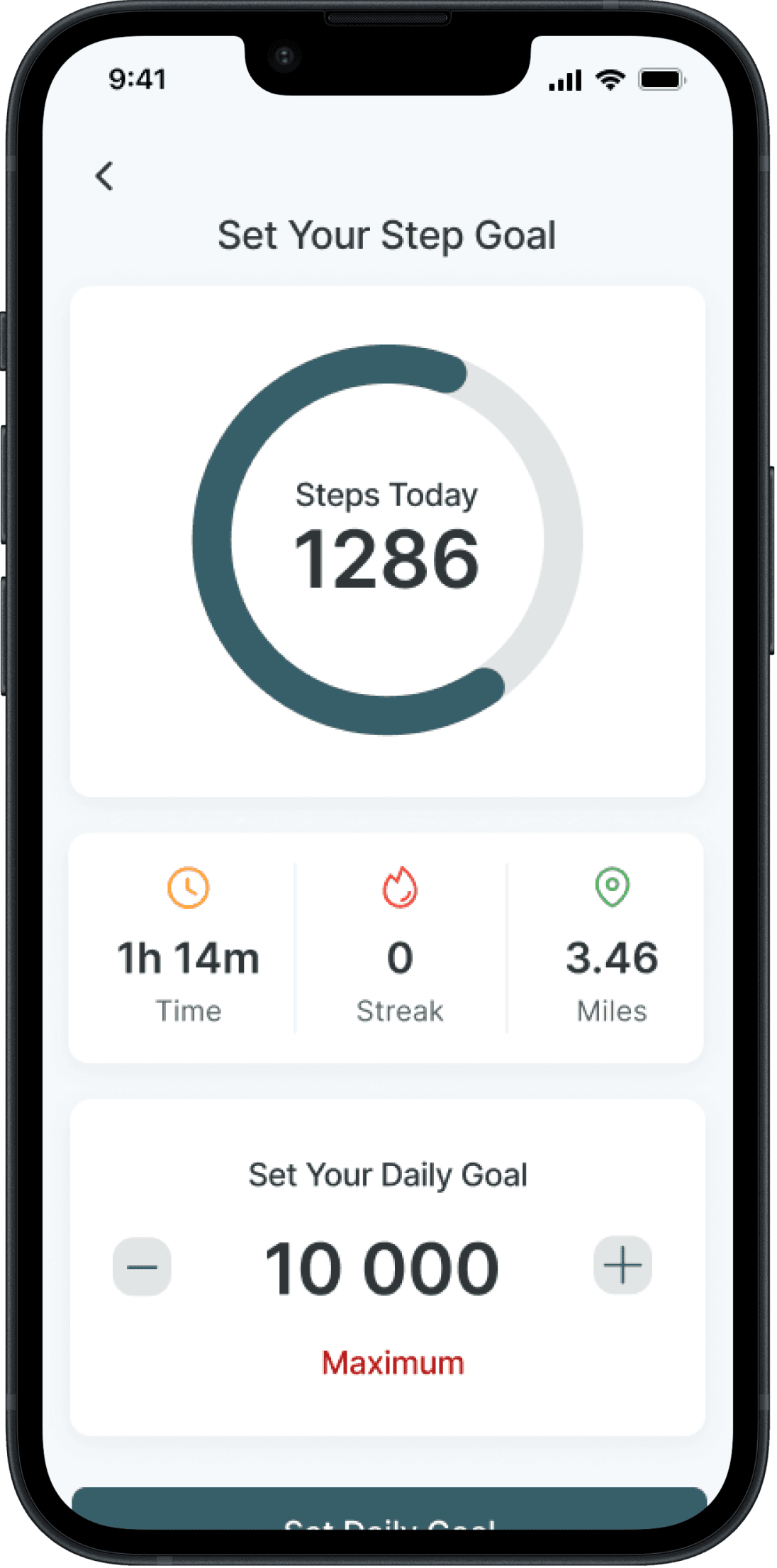
STEP SETTING SCREEN
STEP SETTING SCREEN
AFTER
Iteration:
We removed the mention “Maximum” so that users could add their maximum number of steps
Iteration:
We removed the mention “Maximum” so that users could add their maximum number of steps
Finding:
Users found it confusing to have a restricted number of steps for goal setting
Finding:
Users found it confusing to have a restricted number of steps for goal setting
Finding:
Users found it confusing to have a restricted number of steps for goal setting
BEFORE
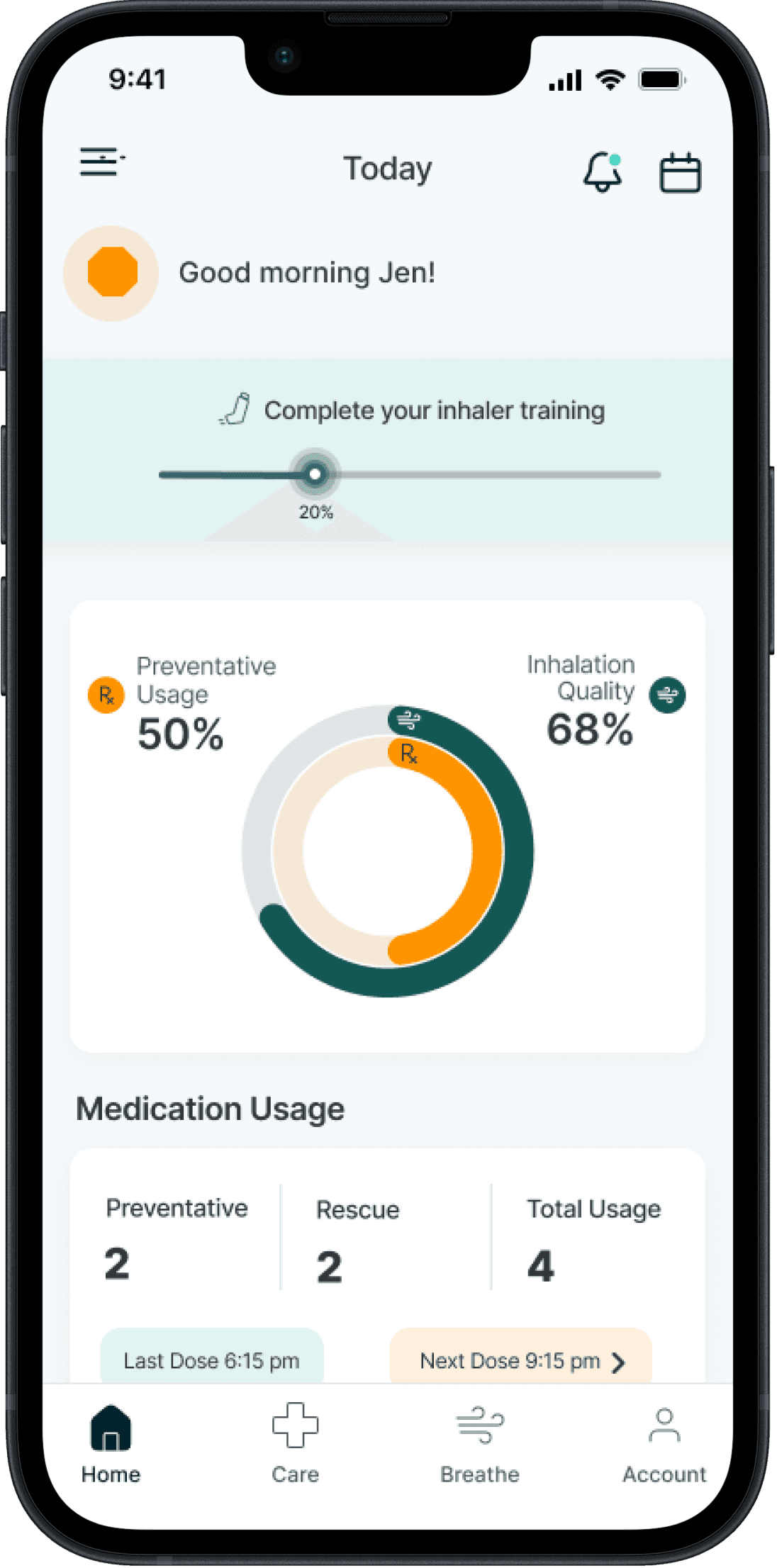
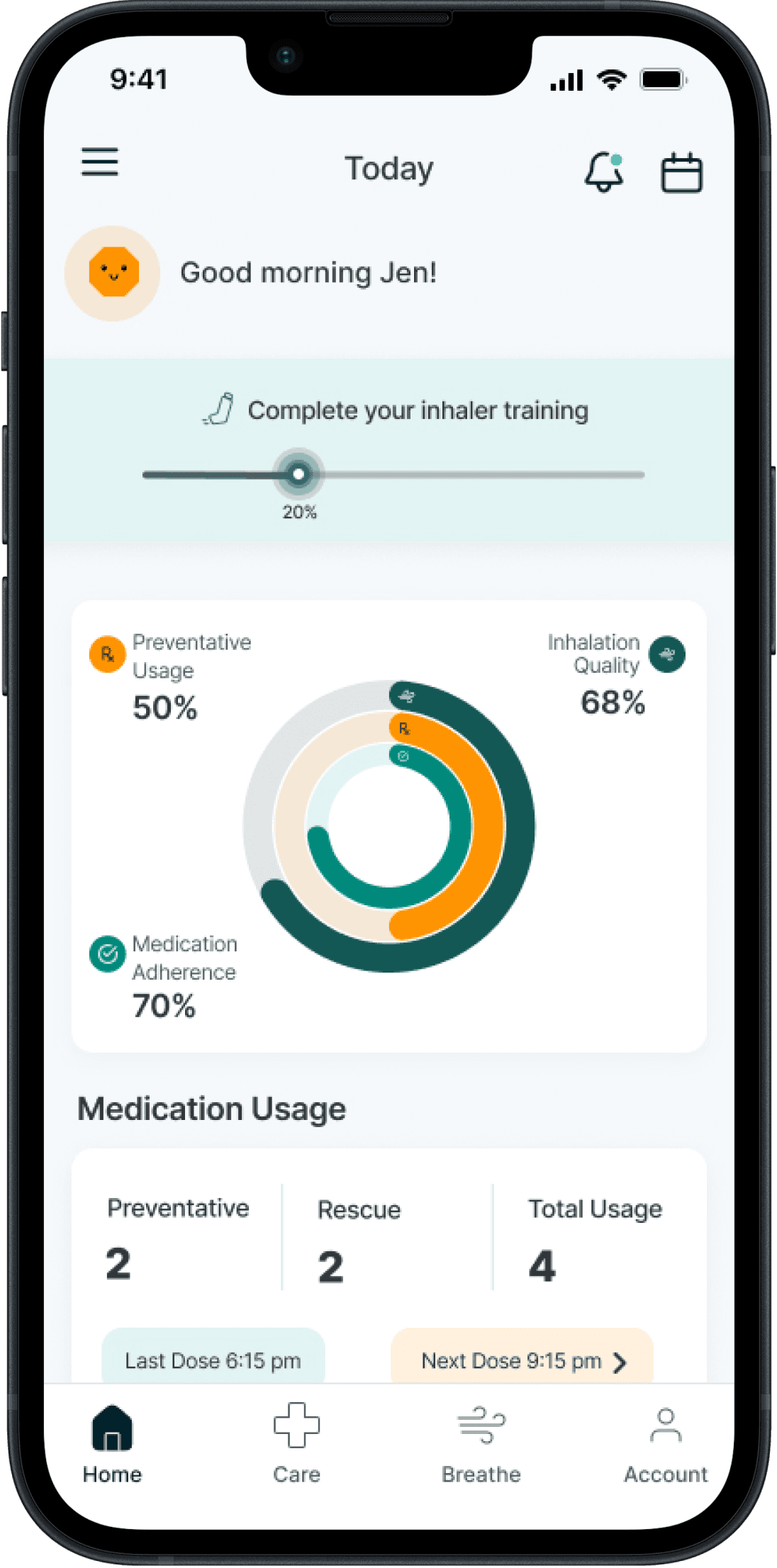
HOME SCREEN
HOME SCREEN
AFTER
Iteration:
We iterated the circle graph to include stats shown on the trend screens and linked it to the “Trend” screen
Iteration:
We iterated the circle graph to include stats shown on the trend screens and linked it to the “Trend” screen
Finding:
Users kept clicking on the circle graph to access trends rather than clicking on the “Breathe icon”
Finding:
Users kept clicking on the circle graph to access trends rather than clicking on the “Breathe icon”
Finding:
Users kept clicking on the circle graph to access trends rather than clicking on the “Breathe icon”
Next Steps
There were changes we weren’t able to implement after our testing, due to tight deadlines. So my next steps would be to implement the following changes:
Access to Avatar and Rewards: Some testers kept clicking on “account” or the hamburger menu to view their avatar/rewards. I would look at adding access to the rewards and coins under the hamburger menu or “account” so users would be able to easily manage their coins and incentives
More Personalisation: To make avatars more distinct on the leaderboard, users could choose from different types of avatars during onboarding or customise their avatar's colour
Exercise Prompt: I would add a prompt for users to complete a breathing exercise whenever they use their reliever inhaler in case of am asthma attack. Users would be able to choose whether or not to complete the exercise
Hands-Free Operation: I would also add voice commands to navigate through breathing exercises as we have done with inhaler training screens, making the app more accessible, especially for users having an asthma attack.
Reflection
This was my first project as part of a UX team, and I feel fortunate to have worked with two other skilled designers who added a unique and fresh perspective to every design solution we created. I struggled at first whenever we didn’t meet a deadline, but this project has taught me the importance of being flexible and working as a team to accomplish our end goal. This project also provided me with a few other valuable lessons that I will take with me:
Communication is key: As we were located in different parts of the world with different time zones, it was essential for us to establish a regular communication schedule to ensure effective collaboration. To make it work, we scheduled catch-up calls at convenient times for everyone. This often meant that some team members had to sacrifice their sleep to join the calls, however we still made it work. In between the calls, we would message each other to keep the progress going with the assigned tasks.
Collaboration: One of our major challenges was to integrate all our designs and ensure they had a consistent look and feel. As all of us were UI designers, we had our own unique preferences. It required numerous iterations to arrive at the final outcome
Iterate, iterate and iterate: We had multiple ideas on how to gamify the app but due to time constraints, we had to prioritise the most feasible ones while still ensuring that our design solutions remained intuitive. This required several iterations but it was a good reminder that the process of iterating and refining is an integral part of an app development
linkedin.com/in/benitatamo/
Want to contact me? I'd love to hear from you!
Thank you for reading!
benita.tamo@gmail.com
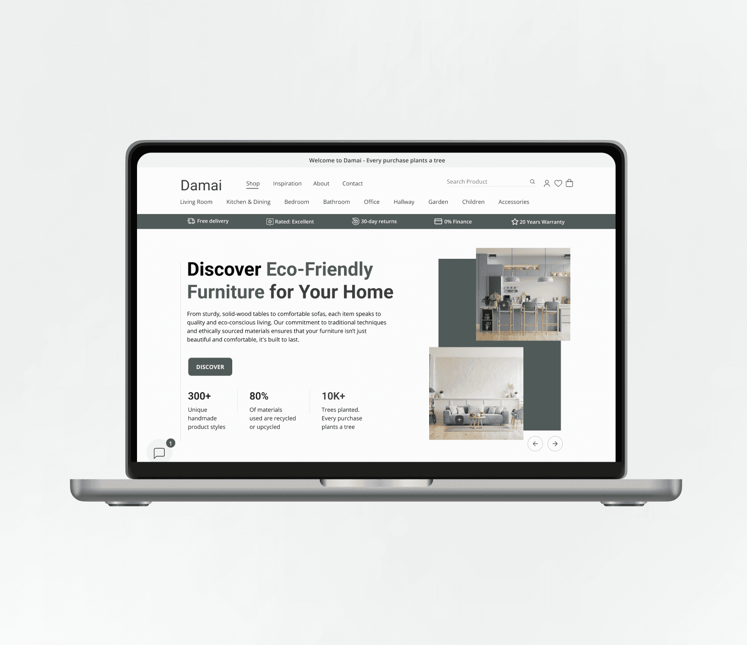
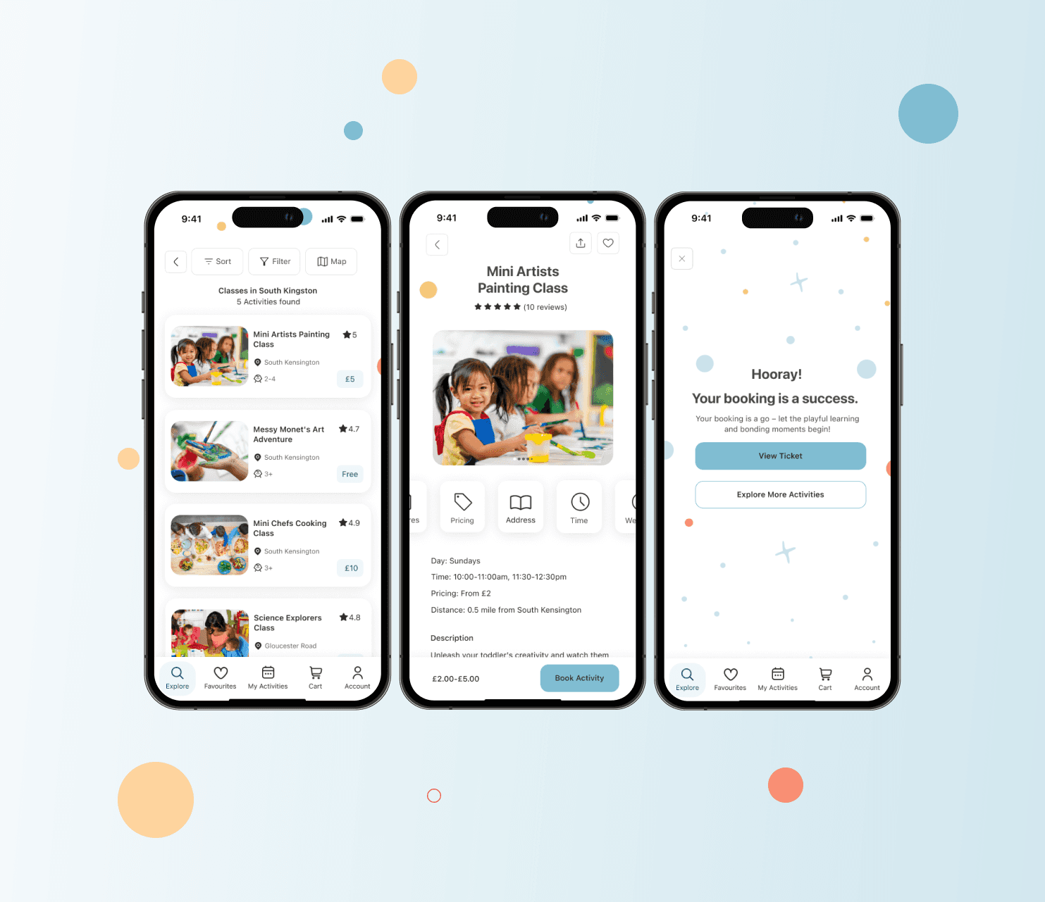
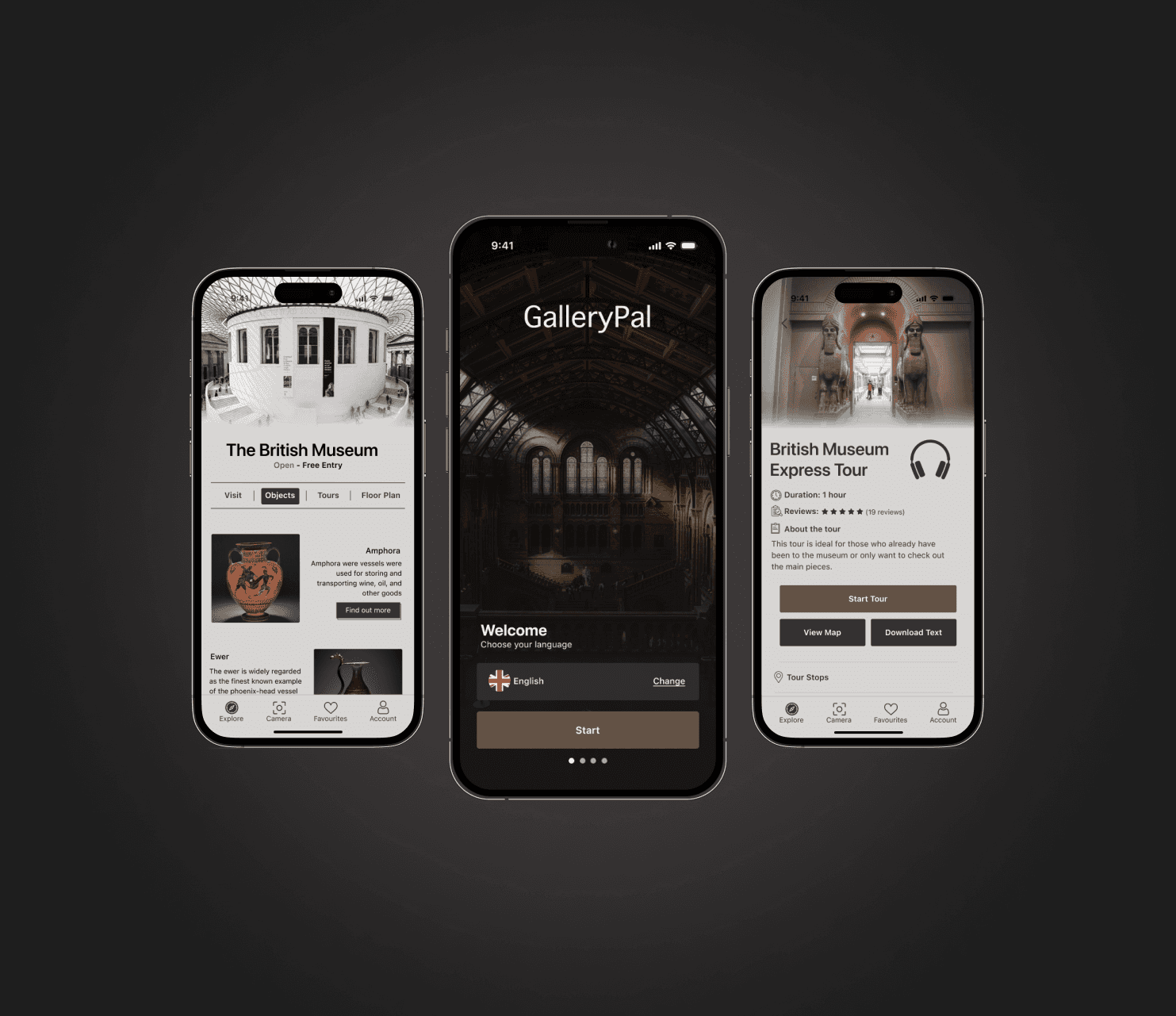
OTHER PROJECTS
OTHER PROJECTS
© 2024 Benita Tamò
Introduction
Problem
Medication Adherence: Patients with asthma often rely solely on their reliever inhaler to manage their symptoms
Incorrect Inhaler Usage: Over 70% of asthmatic patients use their inhaler incorrectly
Traditional concept: Many medical apps have basic features and therefore fail to engage users effectively, resulting in low usage.
Healthcare Support: Most users seek guidance from healthcare professionals rather than apps due to limited support and trust with apps
Interactive Inhaler Training: Prompt users to go through an inhaler training during the onboarding process, which can be skipped if needed
Virtual Companion: Introduce an avatar, which can be customised to create a more personal experience for the user
Personalised Goal Settings: Users can set goals and receive recommendations based on their lung profile as well as set reminders to help them stay on top of their routines called “Missions”
Scoring & Rewards System: By fulfilling their "Missions," users are rewarded with currency within the app, which can be exchanged for both tangible and digital incentives
Leaderboard: Designed to create a sense of community while still keeping users’ privacy intact thanks to the avatar personalisation
Progress Tracking: Create additional screens to help users view and track their progress
BEFORE
AFTER
BEFORE
AFTER
BEFORE
AFTER
Reflection
This was my first project as part of a UX team, and I feel fortunate to have worked with two other skilled designers who added a unique and fresh perspective to every design solution we created. I struggled at first whenever we didn’t meet a deadline, but this project has taught me the importance of being flexible and working as a team to accomplish our end goal. This project also provided me with a few other valuable lessons that I will take with me:
Communication is key: As we were located in different parts of the world with different time zones, it was essential for us to establish a regular communication schedule to ensure effective collaboration. To make it work, we scheduled catch-up calls at convenient times for everyone. This often meant that some team members had to sacrifice their sleep to join the calls, however we still made it work. In between the calls, we would message each other to keep the progress going with the assigned tasks.
Collaboration: One of our major challenges was to integrate all our designs and ensure they had a consistent look and feel. As all of us were UI designers, we had our own unique preferences. It required numerous iterations to arrive at the final outcome
Iterate, iterate and iterate: We had multiple ideas on how to gamify the app but due to time constraints, we had to prioritise the most feasible ones while still ensuring that our design solutions remained intuitive. This required several iterations but it was a good reminder that the process of iterating and refining is an integral part of an app development
benita.tamo@gmail.com
linkedin.com/in/benitatamo/
Want to contact me? I'd love to hear from you!
Thank you for reading!
Research Phase
Secondary Research
In the first few meetings with the client, our goal was to familiarise ourselves with the existing flows and understand the client's needs and requirements. We then conducted secondary research and analysis to understand users' challenges when using medical devices and apps. Due to time constraints, we decided to focus on studies that provide data about asthma and how current apps support users.
Our research revealed the following:
Comparative & Competitive Analysis
Our secondary research provided valuable insights into the challenges faced by users. We decided to conduct further research to look at solutions offered by other health apps and analyse their strengths and weaknesses. I also looked into gamified elements that have proven to be successful within health apps. To achieve this, we carried out a comparative and competitive analysis:
Define Phase
Personas
After gaining a better understanding of medical apps and users’ needs, we created two personas based on their medication adherence. The first persona represents a compliant user who is highly anxious about their condition, while the second persona represents a non-compliant user who is mainly interested in managing symptoms when an asthma attack occurs. These two personas are on opposite ends of the spectrum but helped us gain a better perspective into the different types of patients who would use the app.
Ideation Phase
The HMW questions helped us to narrow down our solutions and prioritise the most important issues. After brainstorming multiple ideas and having conversations with the client, we came up with the following solutions:
Interactive Inhaler Training: Prompt users to go through an inhaler training during the onboarding process, which can be skipped if needed
Virtual Companion: Introduce an avatar, which can be customised to create a more personal experience for the user
Personalised Goal Settings: Users can set goals and receive recommendations based on their lung profile as well as set reminders to help them stay on top of their routines called “Missions”
Scoring & Rewards System: By fulfilling their "Missions," users are rewarded with currency within the app, which can be exchanged for both tangible and digital incentives
Leaderboard: Designed to create a sense of community while still keeping users’ privacy intact thanks to the avatar personalisation
Progress Tracking: Create additional screens to help users view and track their progress
User Flow
We divided the tasks among us, with each designer handling specific user flows. I focused on the avatar’s introduction, goal setting and exercise commendation. We then combined them into a user flow that included all the following red routes:
Onboarding (Inhaler Training, Avatar’s introduction & Goal Setting
Exercise Recommendations
Avatar’s Profile
Inhaler Flow
Trend Flow
Account Flow
High-Fidelity Mockups
Our sketches gave us a better idea of the visuals and content of each screens. Using the style guide provided by the client, we brought those sketches to life:
Prototype & Test Phases
Prototype
We developed a prototype and conducted a round of usability testing with six users. Based on our discussion with the client, the testers were a combination of asthmatic and non-asthmatic users. The objective of these tests was to ensure that the design and flows were intuitive. Here were our findings and iterations:
BEFORE
AFTER
BEFORE
AFTER
BEFORE
AFTER
Next Steps
There were changes we weren’t able to implement after our testing, due to tight deadlines. So my next steps would be to implement the following changes:
Access to Avatar and Rewards: Some testers kept clicking on “account” or the hamburger menu to view their avatar/rewards. I would look at adding access to the rewards and coins under the hamburger menu or “account” so users would be able to easily manage their coins and incentives
More Personalisation: To make avatars more distinct on the leaderboard, users could choose from different types of avatars during onboarding or customise their avatar's colour
Exercise Prompt: I would add a prompt for users to complete a breathing exercise whenever they use their reliever inhaler in case of am asthma attack. Users would be able to choose whether or not to complete the exercise
Hands-Free Operation: I would also add voice commands to navigate through breathing exercises as we have done with inhaler training screens, making the app more accessible, especially for users having an asthma attack.
Reflection
This was my first project as part of a UX team, and I feel fortunate to have worked with two other skilled designers who added a unique and fresh perspective to every design solution we created. I struggled at first whenever we didn’t meet a deadline, but this project has taught me the importance of being flexible and working as a team to accomplish our end goal. This project also provided me with a few other valuable lessons that I will take with me:
Communication is key: As we were located in different parts of the world with different time zones, it was essential for us to establish a regular communication schedule to ensure effective collaboration. To make it work, we scheduled catch-up calls at convenient times for everyone. This often meant that some team members had to sacrifice their sleep to join the calls, however we still made it work. In between the calls, we would message each other to keep the progress going with the assigned tasks.
Collaboration: One of our major challenges was to integrate all our designs and ensure they had a consistent look and feel. As all of us were UI designers, we had our own unique preferences. It required numerous iterations to arrive at the final outcome
Iterate, iterate and iterate: We had multiple ideas on how to gamify the app but due to time constraints, we had to prioritise the most feasible ones while still ensuring that our design solutions remained intuitive. This required several iterations but it was a good reminder that the process of iterating and refining is an integral part of an app development
benita.tamo@gmail.com
linkedin.com/in/benitatamo/
Want to contact me? I'd love to hear from you!
Thank you for reading!