
FunFind: A Directory for Early Years Play Activities
FunFind:
A Directory for Early Years Play Activities
Timeline: March - August 2023
UX/UI Case Study
Tool: Figma
Timeline: March - August 2023
Timeline: March - August 2023
UX/UI Case Study
UX/UI Case Study
Tool: Figma
Tool: Figma
FunFind: A Directory for Early Years Play Activities
Timeline: March - August 2023
UX/UI Case Study
Tool: Figma
FunFind: A Directory for Early Years Play Activities


FunFind: A Directory for Early Years Play Activities
Project Overview: Unveiling FunFind, A Solution for Parents and Young Explorers
Project Overview: Unveiling FunFind, A Solution for Parents and Young Explorers
Project Overview: Unveiling FunFind, A Solution for Parents and Young Explorers
Background
Background
Background
This project was born out of my own personal journey as a new parent. I wanted to create memories with my little one and be as involved as I could in his early childhood but struggled to find comprehensive and up-to-date information on local activities I could do with him. This led me to speak with other parents and understand their experience.
I realised I wasn’t alone, many parents felt the same. When it was time to pick my first project as part of my UX course, I knew this was it. I was determined to create a solution that would make their lives, our lives, easier.
Problem
Problem
Problem
Parents' active involvement in play during early childhood has proven to have a profound impact on children's development. Yet parents struggle to spend time with their children.
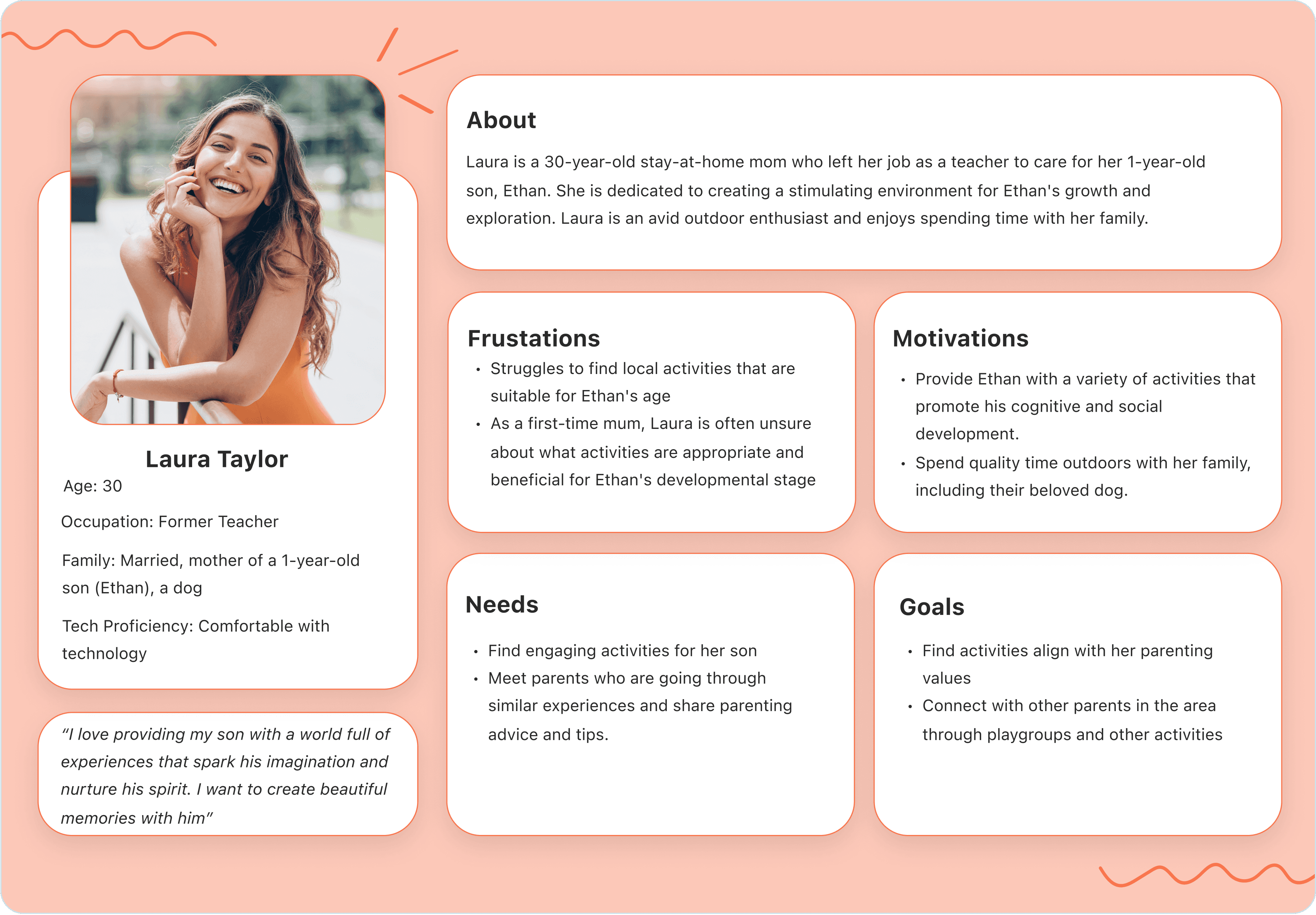
One common reason for this is the lack of time and the struggle of finding activities that are age-appropriate, cost-effective, and align with their values and interests.
Solution
Solution
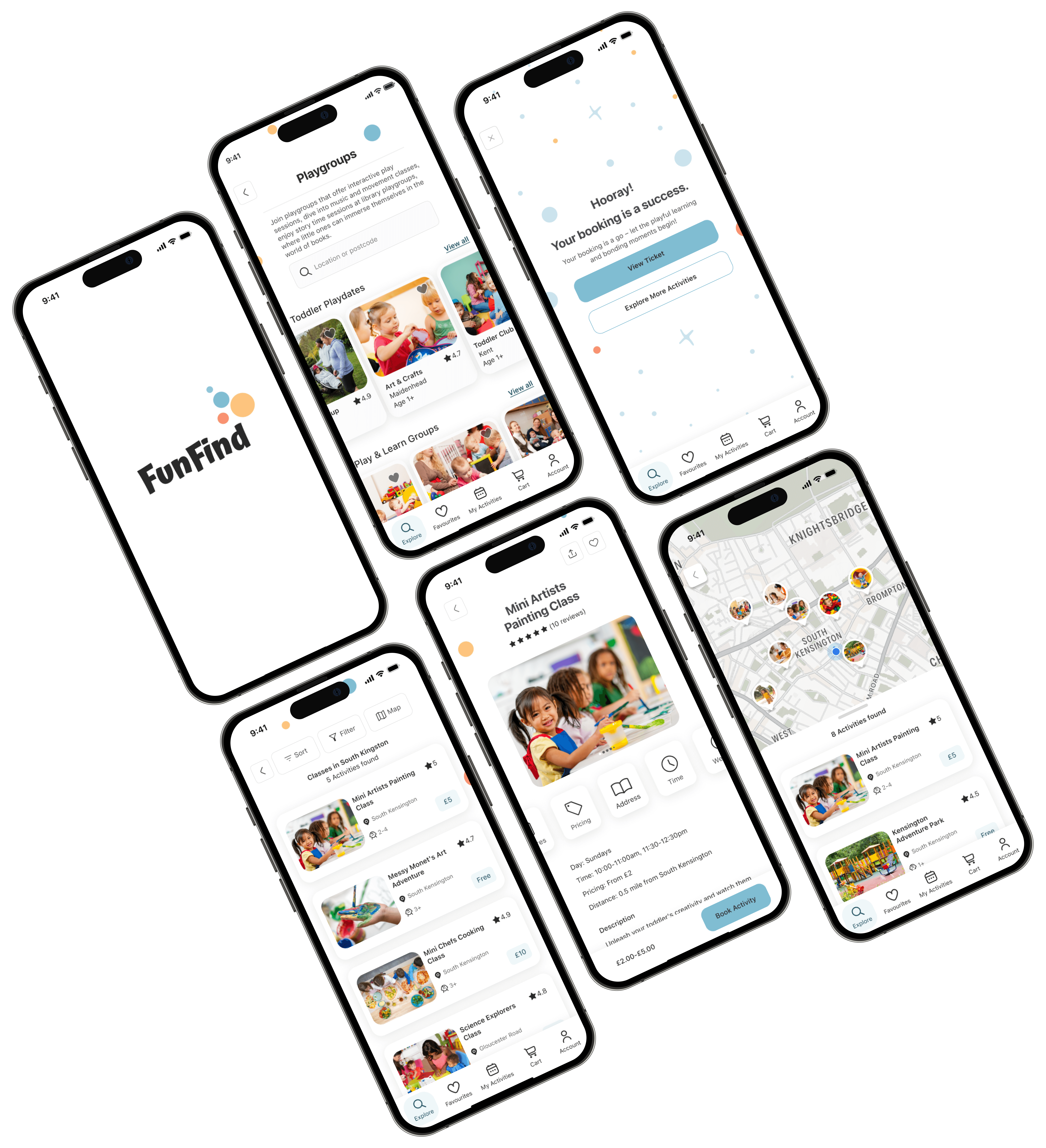
This is how FunFind came to life. A mobile application designed to cater to the needs of parents seeking enriching play activities for their children aged 5 and under. The app serves as a comprehensive platform, simplifying the process of discovering, booking, and enjoying a diverse array of activities that stimulate learning, imagination, and bonding.
This is how FunFind came to life. A mobile application designed to cater to the needs of parents seeking enriching play activities for their children aged 5 and under. The app serves as a comprehensive platform, simplifying the process of discovering, booking, and enjoying a diverse array of activities that stimulate learning, imagination, and bonding.
2.1. Affinity Map
2.1. Affinity Map
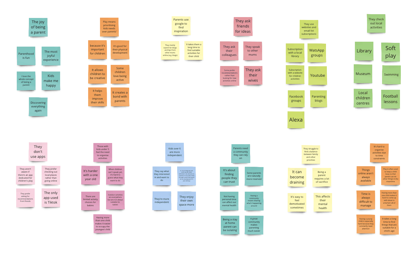
After gathering all the necessary data, I started looking for similarities in parents' feedback. I used an affinity map for this and came up with 12 themes:
After gathering all the necessary data, I started looking for similarities in parents' feedback. I used an affinity map for this and came up with 12 themes:
2.2. Personas
2.2. Personas
Two primary personas emerged from my analysis:
Two primary personas emerged from my analysis:
2.3 How Might We Problem Statements (HMW’s)
2.3 How Might We Problem Statements (HMW’s)
The two personas helped me understand better the challenges parents were facing. Using my personas, I generated four How Might We problem statements:
The two personas helped me understand better the challenges parents were facing. Using my personas, I generated four How Might We problem statements:
Activity Variety:
How might we help Chris and Laura discover a diverse range of activities that cater to their children’s age groups, needs and interests, ensuring that they also align with their own preferences?
Activity Variety:
How might we help Chris and Laura discover a diverse range of activities that cater to their children’s age groups, needs and interests, ensuring that they also align with their own preferences?
Time Management:
How might we streamline the process of searching, booking, and managing activities, allowing Chris and Laura to efficiently plan their schedules and allocate quality time for their children's enrichment?
Time Management:
How might we streamline the process of searching, booking, and managing activities, allowing Chris and Laura to efficiently plan their schedules and allocate quality time for their children's enrichment?
Community Engagement:
How might we foster a sense of community among Laura and create a supportive network?
Community Engagement:
How might we foster a sense of community among Laura and create a supportive network?
Quality Assurance:
How might we ensure the quality and safety of listed activities, empowering Chris and Laura to make informed decisions about the activities they choose for their children?
Quality Assurance:
How might we ensure the quality and safety of listed activities, empowering Chris and Laura to make informed decisions about the activities they choose for their children?
I found the ideation phase to be more challenging than expected. I had many ideas but struggled to choose one. After revisiting my competitive analysis and testing some of my ideas with sketches, I eventually settled on a final concept. Once that was done, I progressed to creating user stories, refining my sketches, and designing wireframes and high-fidelity mockups.
I found the ideation phase to be more challenging than expected. I had many ideas but struggled to choose one. After revisiting my competitive analysis and testing some of my ideas with sketches, I eventually settled on a final concept. Once that was done, I progressed to creating user stories, refining my sketches, and designing wireframes and high-fidelity mockups.
3.1. Concept Generation
3.1. Concept Generation
3.1. Concept Generation
Solution: A children’s activity directory to help parents easily find and book play activities for children aged 0 to 5, while also allowing them to meet other parents and form new friendships.
Brand Name: The brand name, FunFind, represents the fun aspect of the application and the purpose of it which is to help parents find children activities
3.2. User Stories & Minimal Viable Products (MVP’s)
3.2. User Stories & Minimal Viable Products (MVP’s)
3.2. User Stories & Minimal Viable Products (MVP’s)
User stories and MVP’s helped me define the most important functionalities of the app:
User stories and MVP’s helped me define the most important functionalities of the app:
3.6.2. High Fidelity Mockups
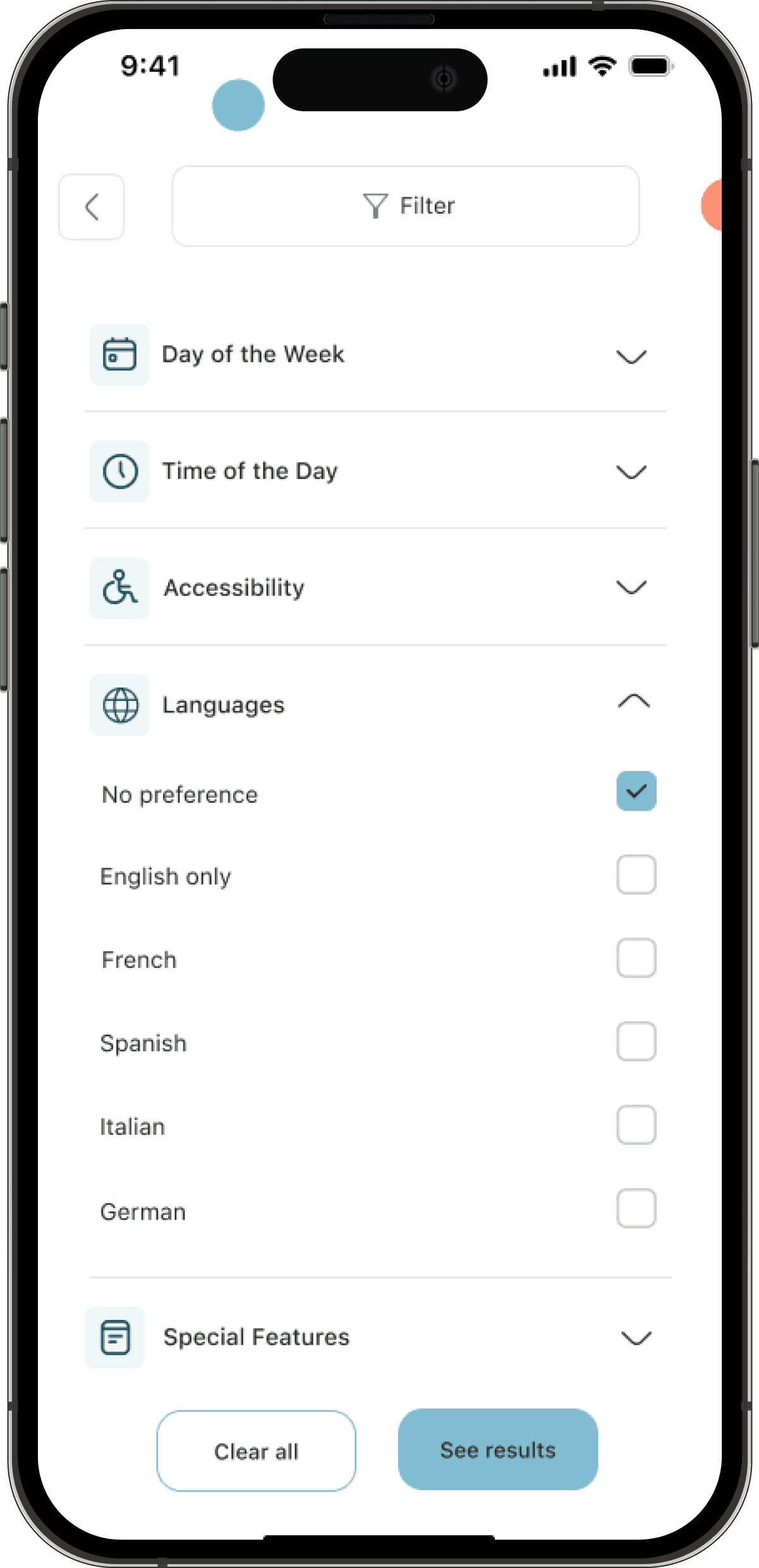
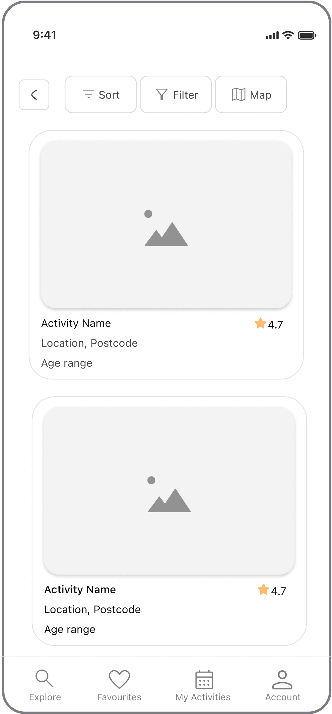
Using the visual design, I then moved on to create high fidelity mockups. On the explore screen, I changed the visual to include larger pictures for activity categories and more text space. On the results page, I improved the card layout to show more activities while scrolling. Additionally, I adjusted the text colour to a darker shade to guarantee improved readability.
Explore Screen
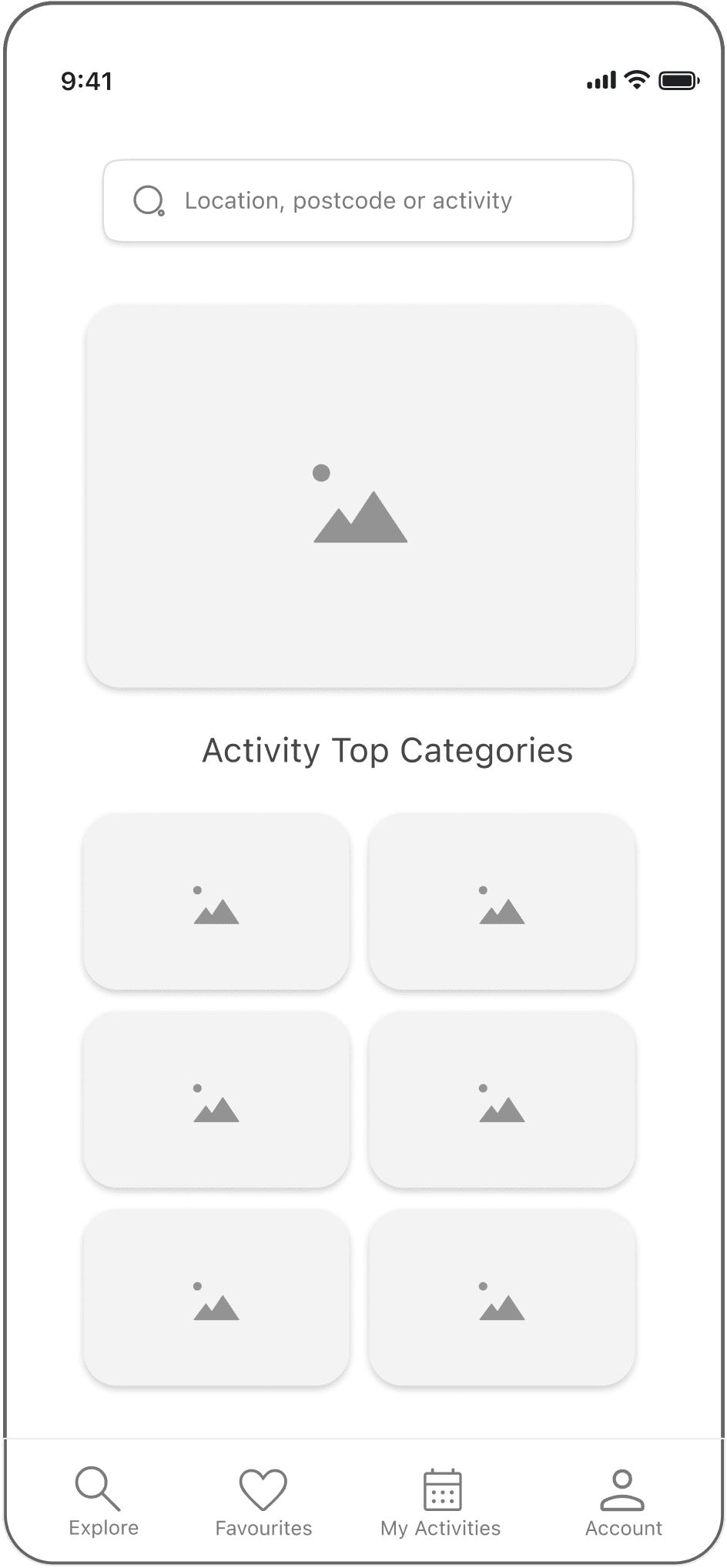
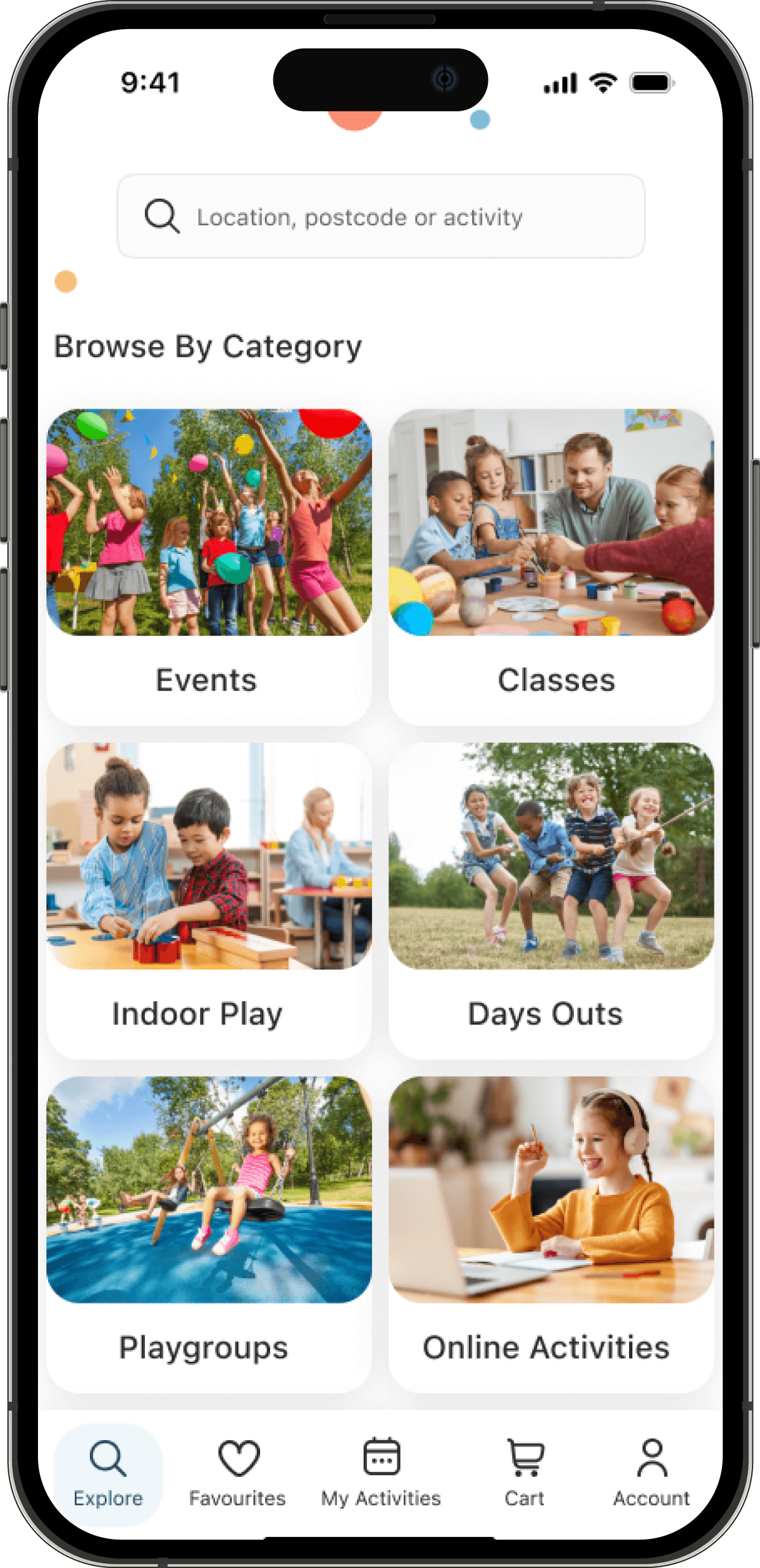
Results Screen
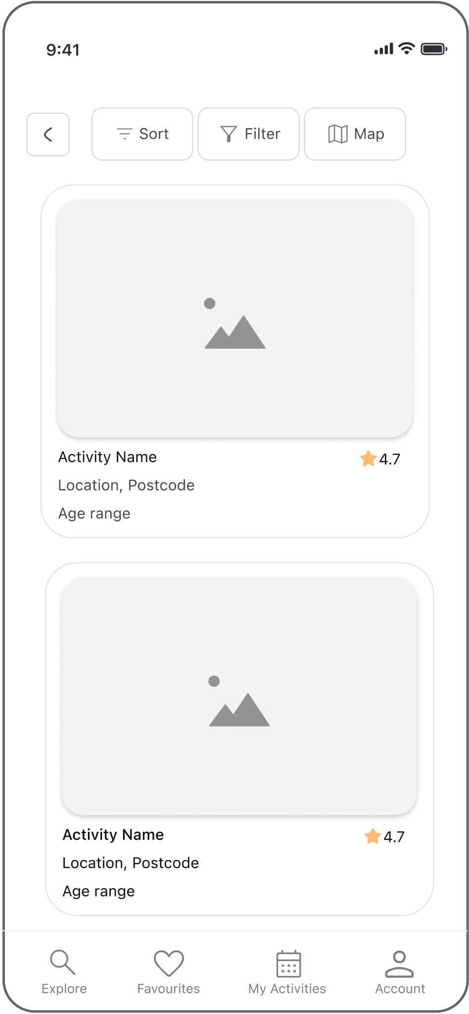
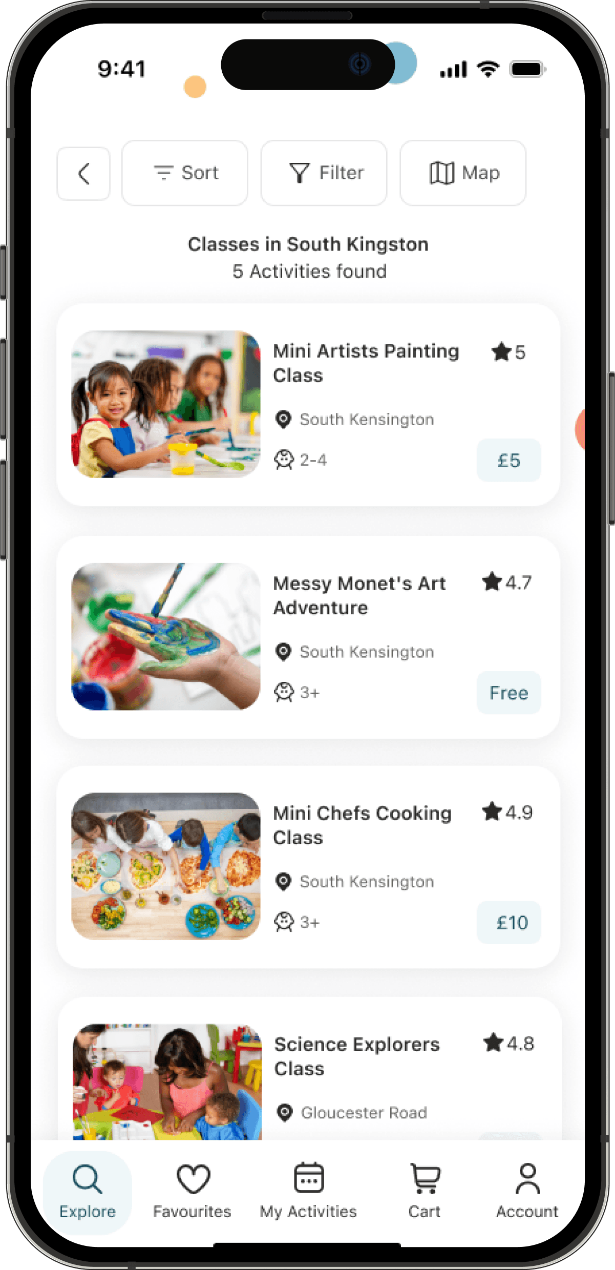
Filter Screen


Next
Next
Next
For my next steps there are many features I would like to add:
Incorporate social features such as forums and community groups to support parents and allow them to connect with other parents on the app
Create a child profile feature that would allow users to save preferences for each child based on their needs and interests
Offer integrations with external services such as a google map to create a seamless end-to-end experience for parents, making it easy to plan and execute outings with their children
Add accessibility features to allow users with visual or hearing impairments to be able to use the app.
Reflection
As the sole UX designer on FunFind, this journey has been an incredible learning experience, filled with highs, lows, and growth. When I picked this project, I was excited to create a product that would help parents spend quality time with their children and create beautiful memories. Life is too short to miss those precious moments! Going through the process was at times challenging but it was fun creating something from scratch and seeing it unfold as I worked on it. At the end of the project, the positive feedback from parents made it all so worth it, more than just learning a course.
Looking back:
-> I wish I had focused more on accessibility to ensure that the app could be used by more parents, regardless of their skills and abilities
-> Testing was also a good learning experience for me. It helped me see problems that I would have never noticed without it.
As I’m closing this project, I’m moving forward with a new passion for user experience design. I’m taking with me the valuable lessons I’ve learned and I’m excited to create more meaningful experiences for people.
4.1. Findings and Iterations
4.1. Findings and Iterations
4.1. Findings and Iterations
I completed two rounds of testing to assess the overall user experience and uncover areas of improvement. Each testing round involved 5 participants who were asked to complete two tasks: Find an activity for their child and book it on FunFind.
Class Page:
I completed two rounds of testing to assess the overall user experience and uncover areas of improvement. Each testing round involved 5 participants who were asked to complete two tasks: Find an activity for their child and book it on FunFind.
Class Page:
BEFORE
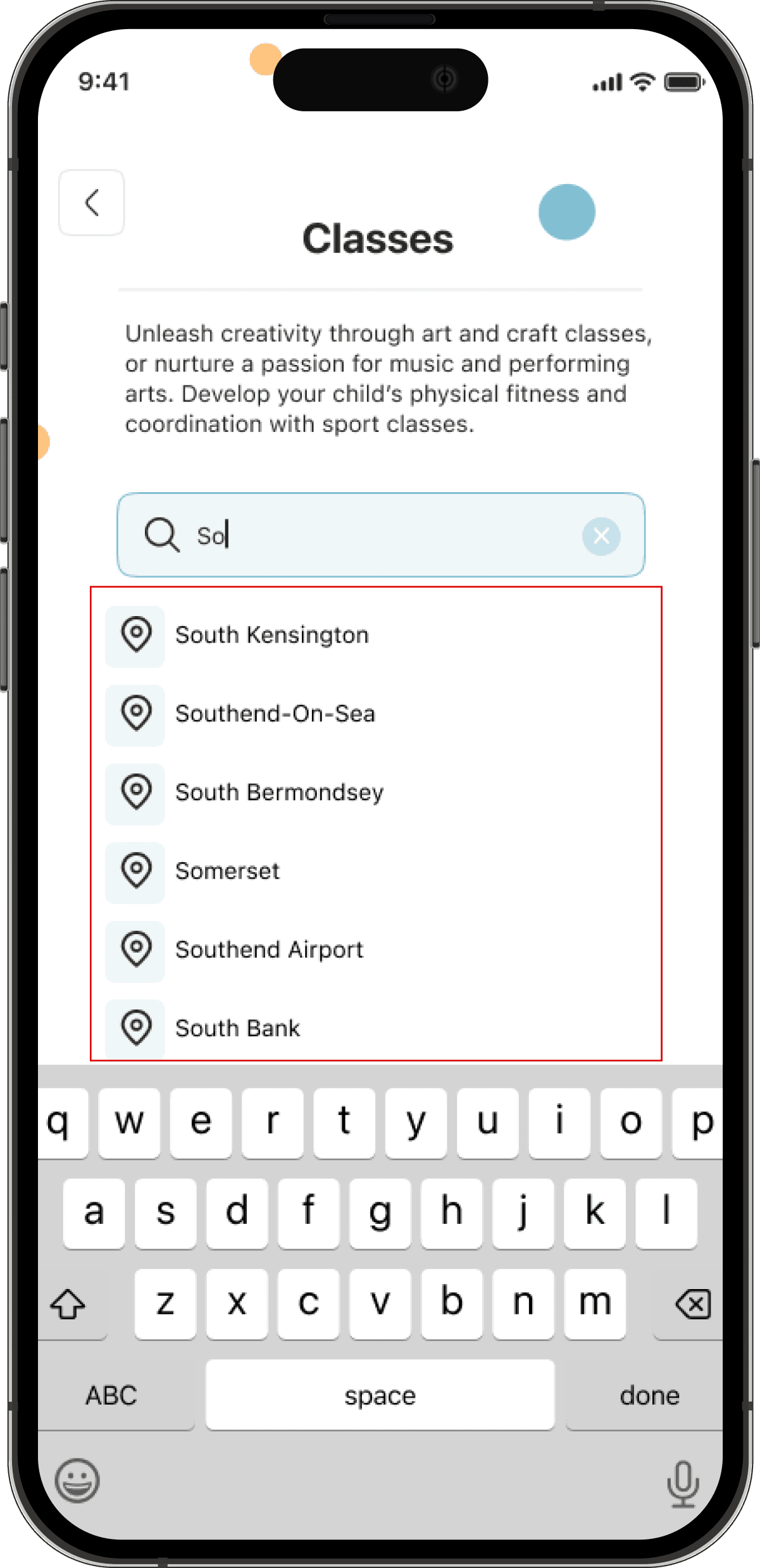
Finding:
Users didn’t see featured classes on this page. They suggested adding them below the search bar.
Iteration:
Featured classes were adding before clicking in the search bar
AFTER

4.2. Final Mockups and Prototype
4.2. Final Mockups and Prototype
4.2. Final Mockups and Prototype
AFTER
AFTER
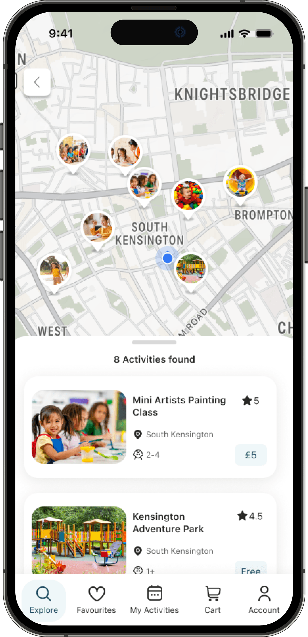
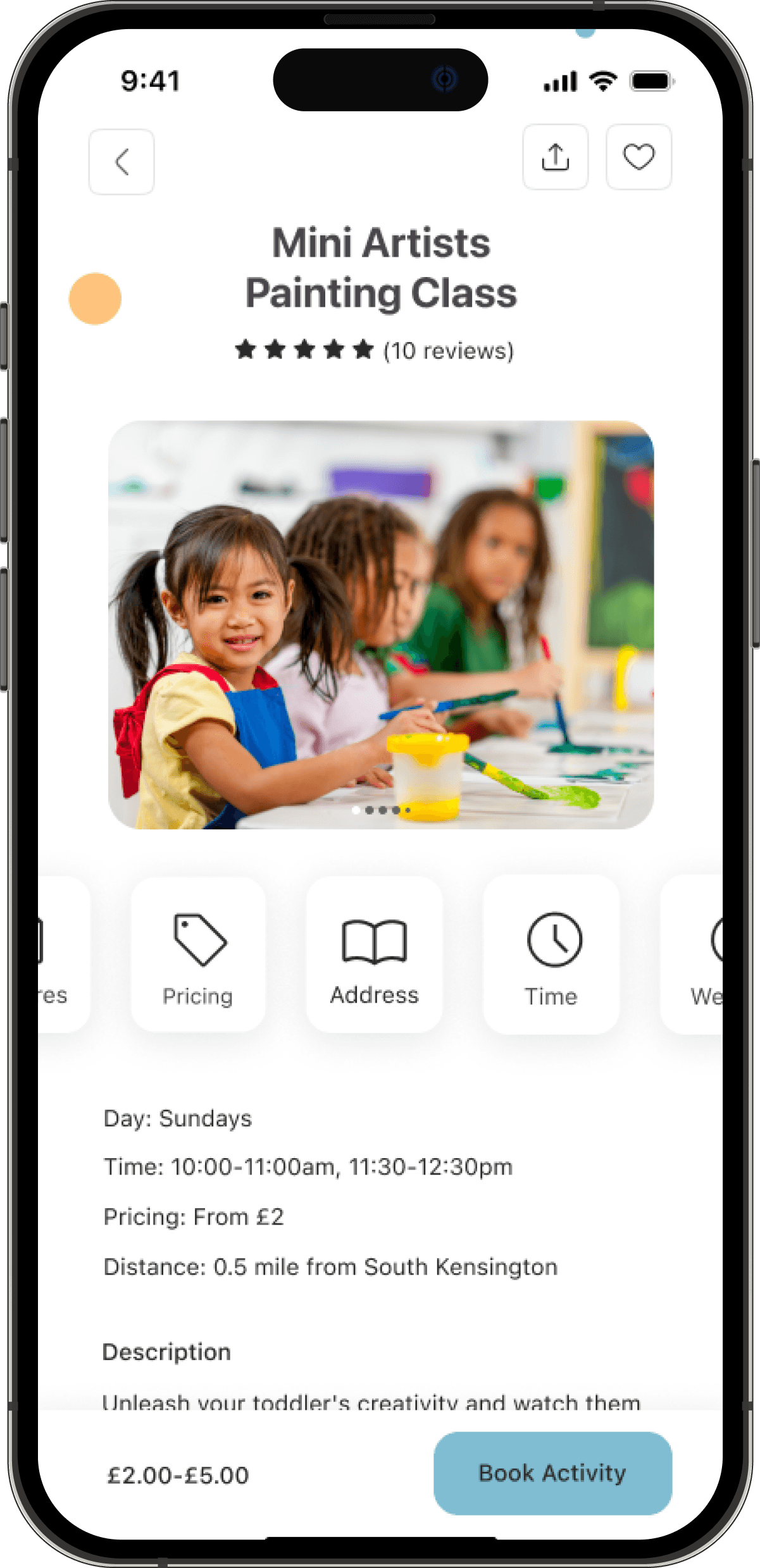
Activity Page:
Activity Page:
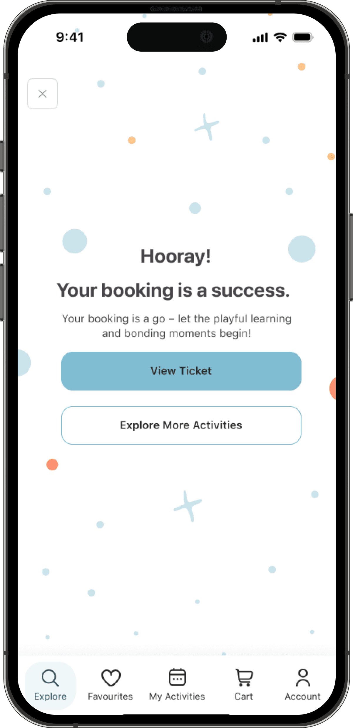
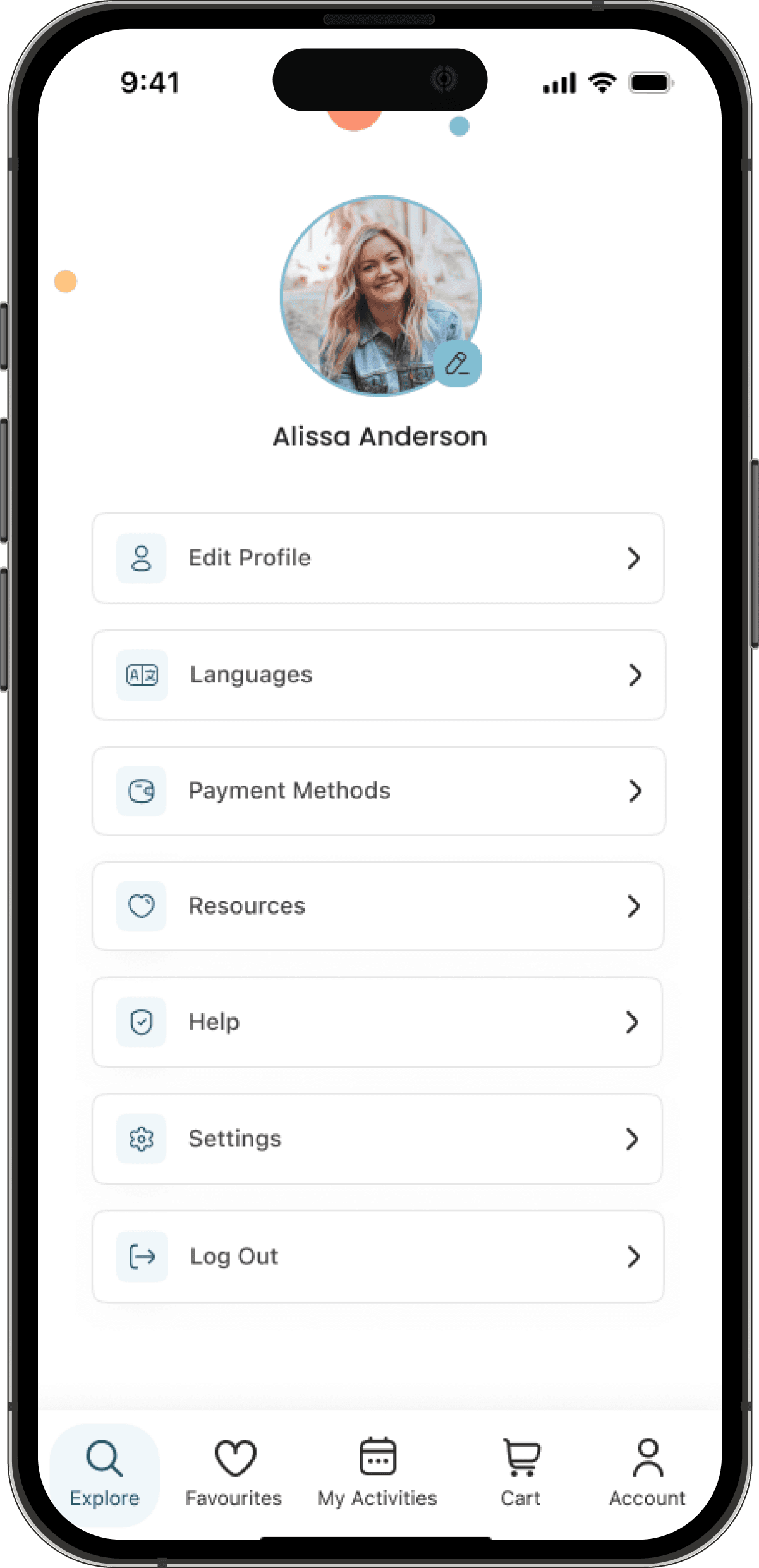
Other Key Screens:
Other Key Screens:
3.3. User Flow
3.3. User Flow
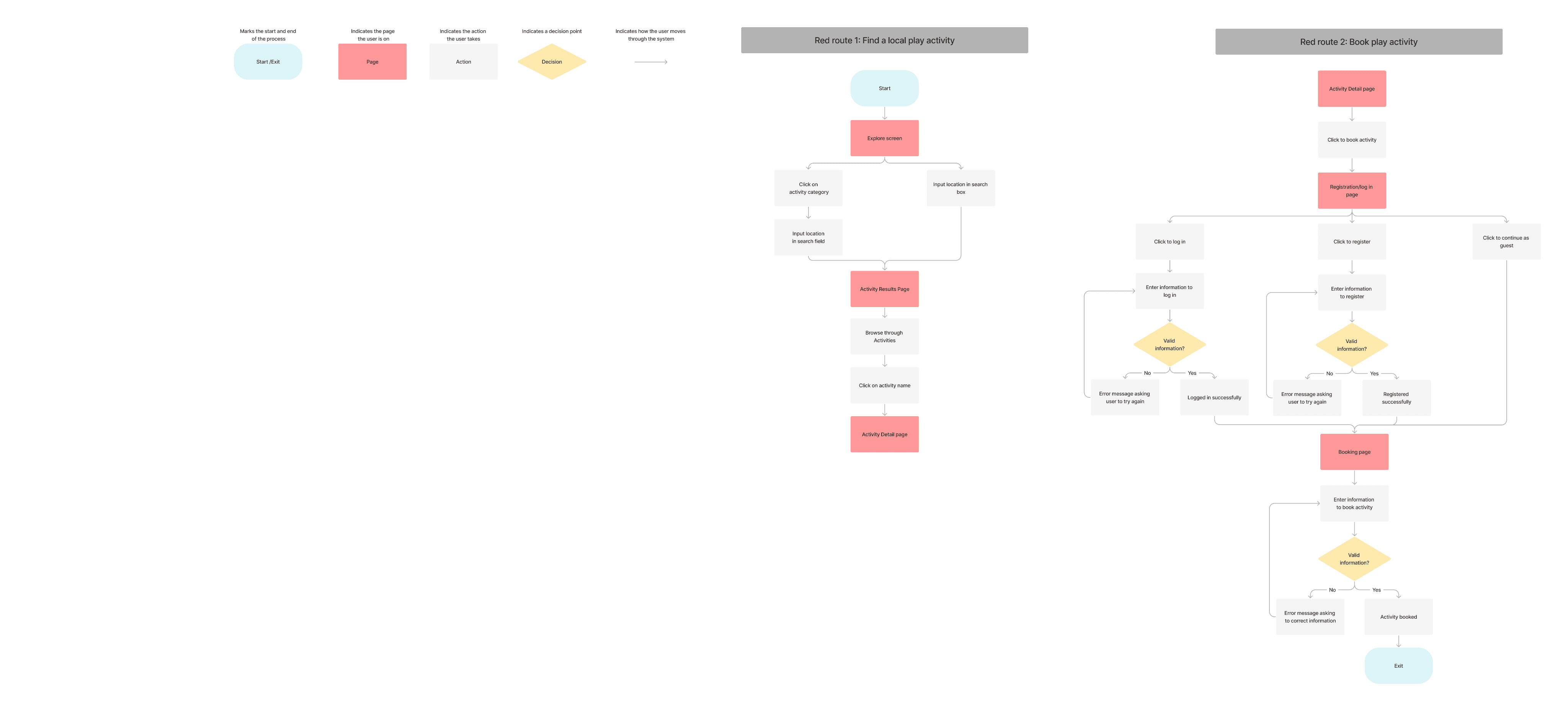
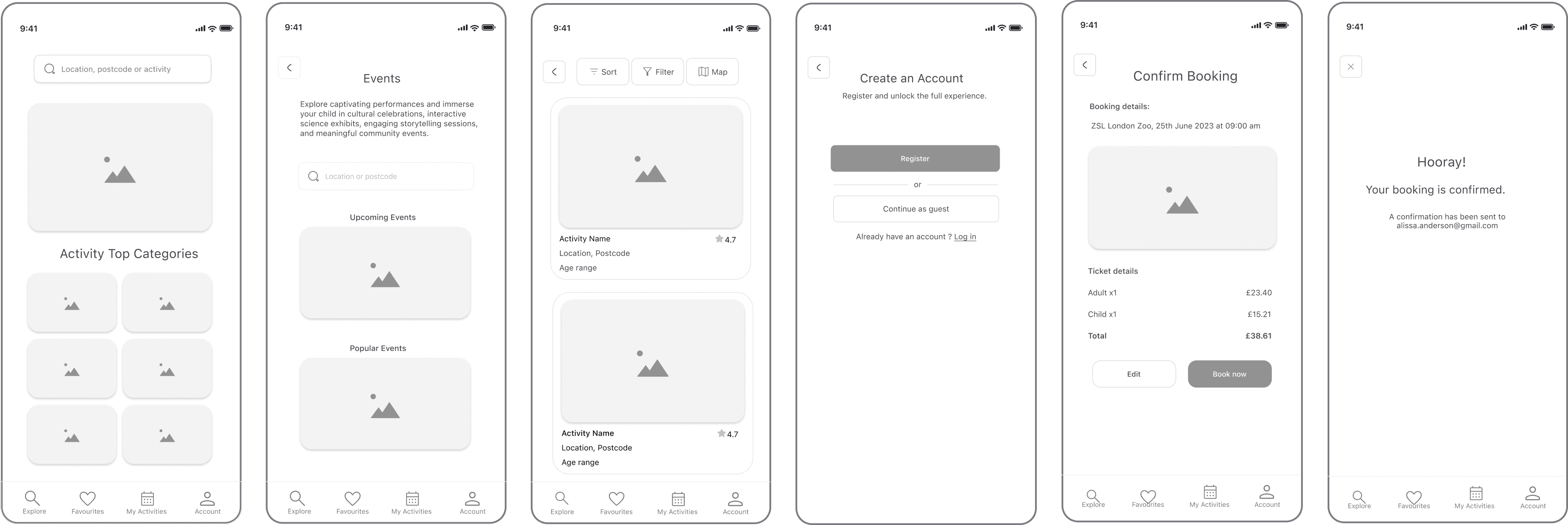
I also created a user flow with two major red routes: Find activities and book activities.
I also created a user flow with two major red routes: Find activities and book activities.
3.4. Sketches & Usability Testing
3.4. Sketches & Usability Testing
3.4. Sketches & Usability Testing
3.4.1. Sketches
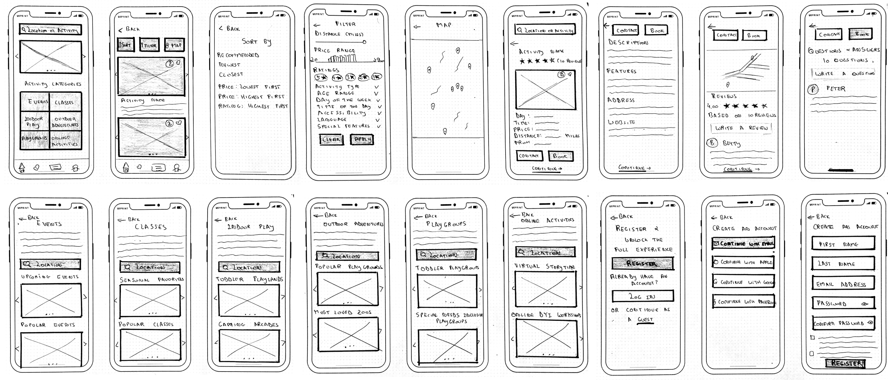
Alongside my user flow, I sketched my ideas on paper, then tested them with 5 participants using Guerrilla Usability Testing. While it was intimidating at first to speak with strangers, I’m glad I pushed past my fear and got some valuable feedback on my work. Here are my sketches:
3.4.1. Sketches
Alongside my user flow, I sketched my ideas on paper, then tested them with 5 participants using Guerrilla Usability Testing. While it was intimidating at first to speak with strangers, I’m glad I pushed past my fear and got some valuable feedback on my work. Here are my sketches:
3.4.2. Guerrilla Testing - Findings
3.4.2. Guerrilla Testing - Findings
The user testing revealed the following:
The user testing revealed the following:
Booking Flow: one user mentioned that the booking process was too long. There were too many screens before booking the activity.
Usability Challenges: some of the back buttons weren’t working which confused users
Interaction: A couple of users didn’t know how to go past the results page. The activity name wasn’t interactive, but the picture was.
3.4.3. Guerrilla Testing - Iterations
When translating my sketches into wireframes, I made iterations to address the identified usability and accessibility issues. The goal was to refine the app's design based on user feedback, ensuring a more intuitive user experience.
Booking Flow: Building on user feedback, I removed the screens prompting users to create a child’s profile before booking an activity. This helped minimise steps and enhance the overall convenience for users
Usability Challenges: I ensured all the back and exit buttons were added correctly. I also simplified these buttons to make them more intuitive and easy recognisable (the wording “back” was changed to a back icon)
Interaction: While creating my prototype later in the process, I ensured the results page was interactive, allowing users to move to the following page.
3.6. High Fidelity Mockups
3.6. High Fidelity Mockups
3.6. High Fidelity Mockups
3.6.1. Visual Design
3.6.1. Visual Design
My visual elements were carefully selected to resonate with parents and align with the playful and informative nature of the app:
Rational: The purpose of the brand wasn’t only to find fun activities for young children but also to remind parents of the joy that comes with discovering life and new experiences with a child.
Brand identity: I wanted the visual design to be centred around vibrant colours to represent laughter and joy, as well as have a colour that signified calmness. An app where parents wouldn’t feel overwhelmed with the design but have a sense of peace and calmness, remembering the joy that comes with play. So I chose blue as my primary colour and yellow and orange as my accent colours.
Typography: I opted for a friendly and easily legible sans-serif font for all my texts, San Francisco Pro (SF Pro).
Imagery: High-quality imagery was handpicked to showcase the diversity of activities offered on the app. These images depict children actively engaged in activities, capturing moments of joy and exploration. Each image aims to evoke emotions, making parents feel confident in the value of the activities they’re exploring.
Accessibility: Accessibility considerations were integrated into the visual design to ensure that the app was usable by parents. I adhered to colour contrast guidelines following the WCAG compliance rules and selected font sizes that people could easily read (14px for my body text and 19px for my headers).
UI Components: I wanted my buttons and cards to have curved corners to reflect the friendly aspect of the app
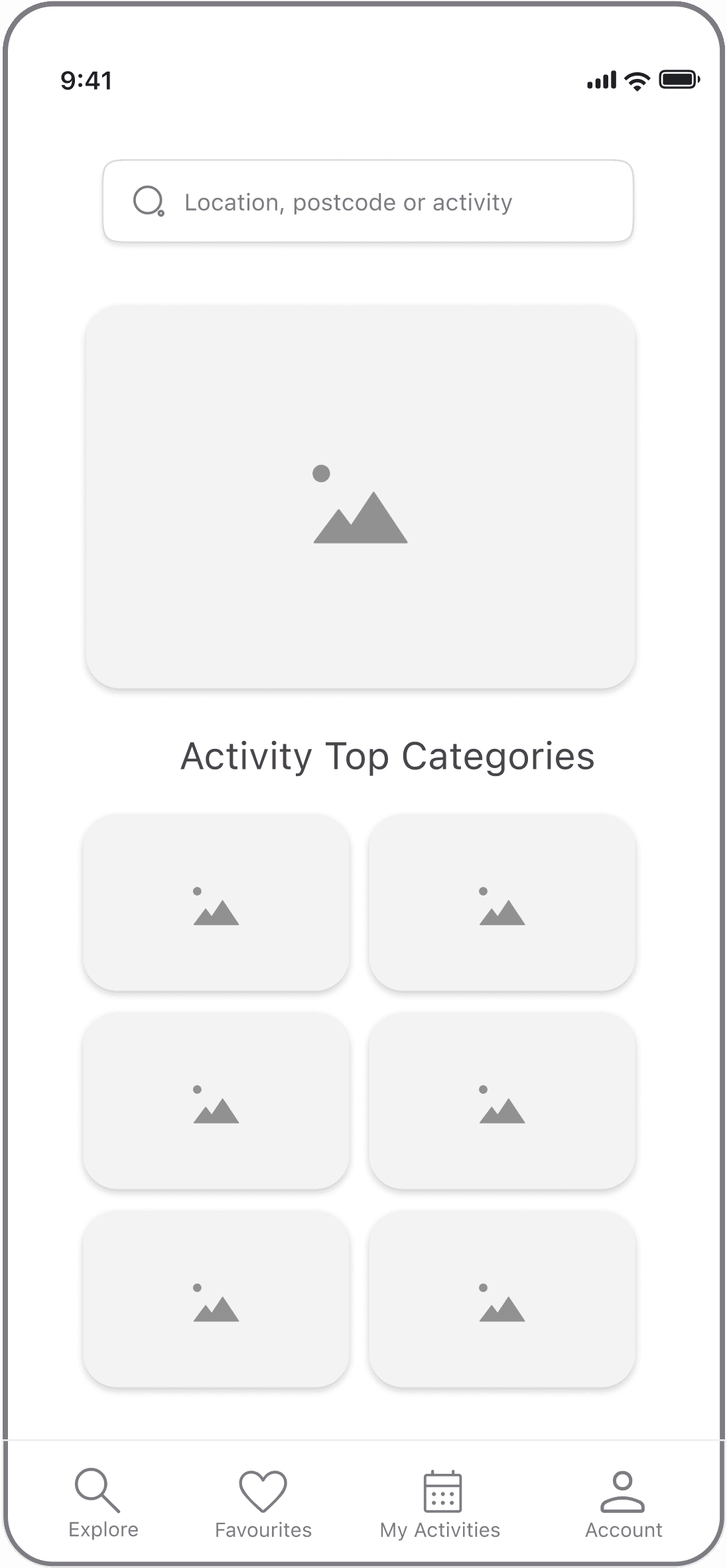
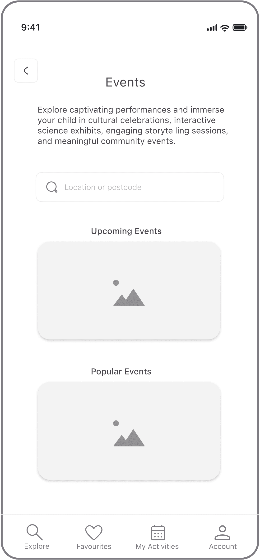
3.5. Mid Fidelity Wireframes
3.5. Mid Fidelity Wireframes
3.5. Mid Fidelity Wireframes
The user testing revealed the following:
The user testing revealed the following:
3.5.2. Wireflows
3.5.2. Wireflows
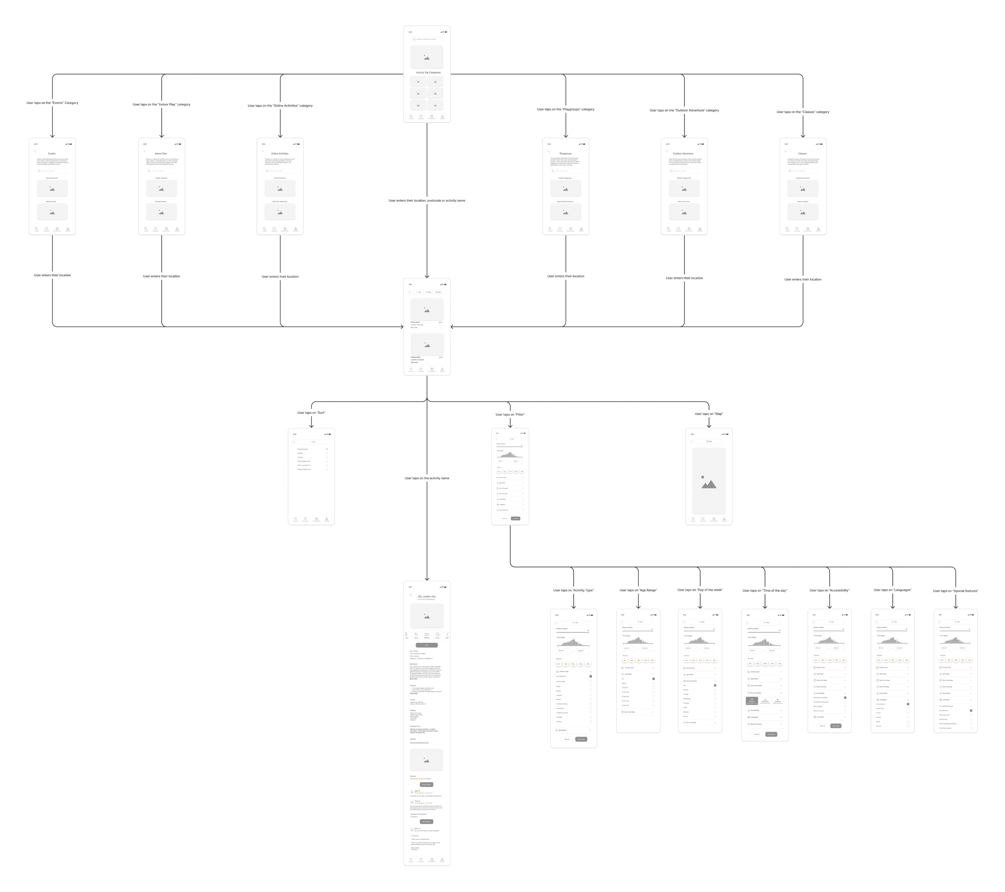
Red Route 1: Find a play activity
Red Route 1: Find a play activity

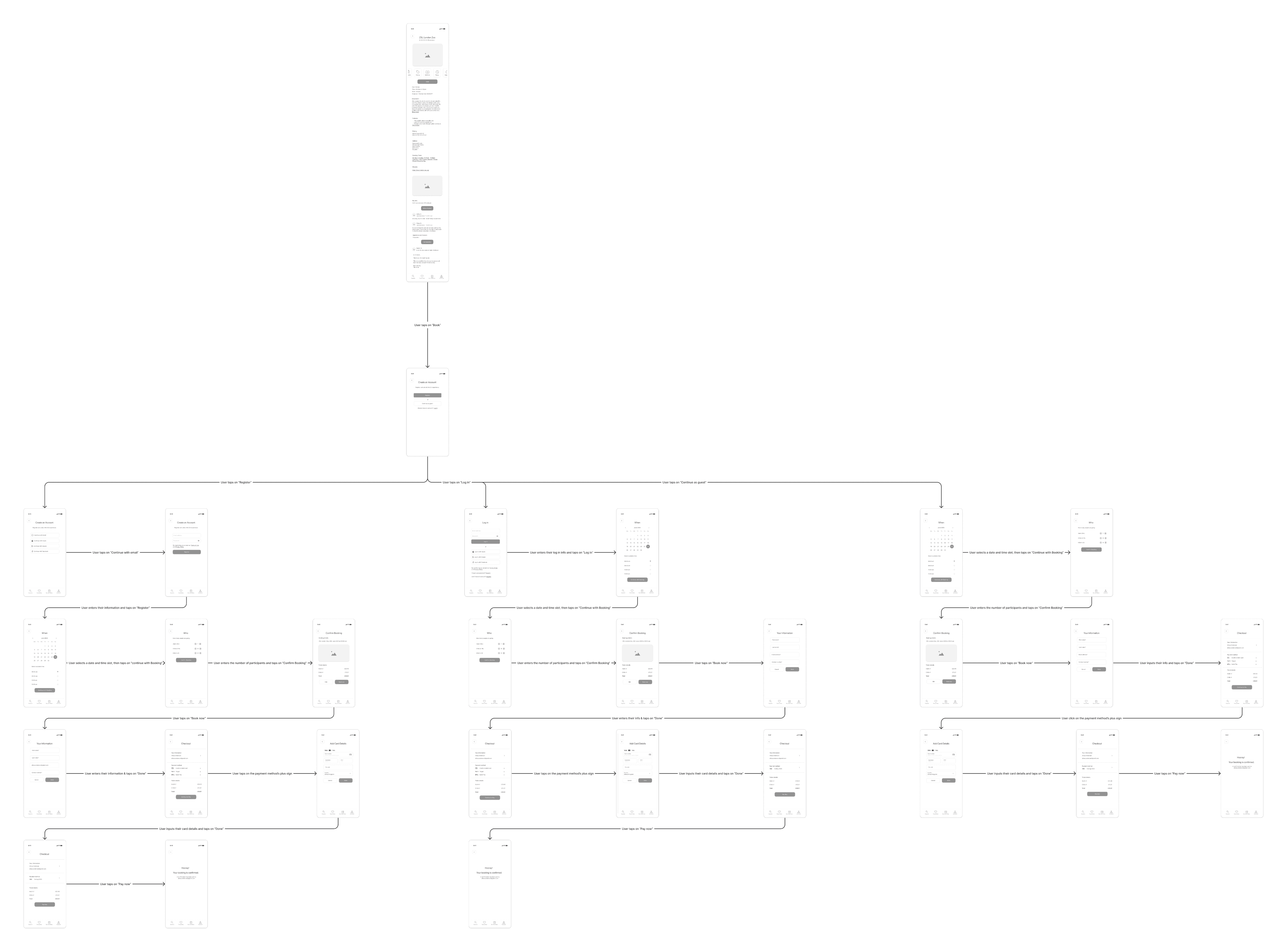
Red Route 2: Book an activity
Red Route 2: Book an activity

To view the wireflows, click here
To view the wireflows, click here
3.7. Edge Cases
Search for a specific activity: Parents may wish to enter an activity name rather than a location or postcode. The search bar was adapted to allow parents to search by location, postcode, or activity name.

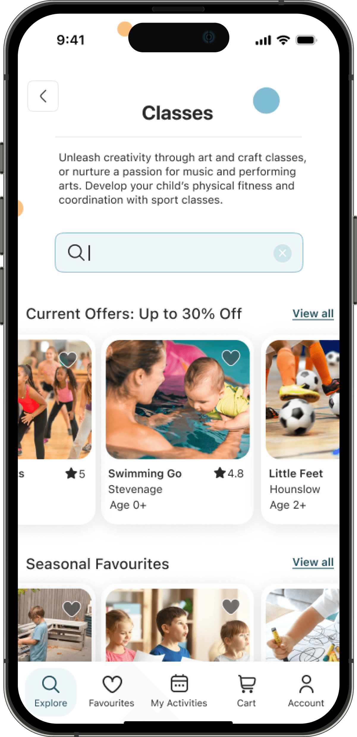
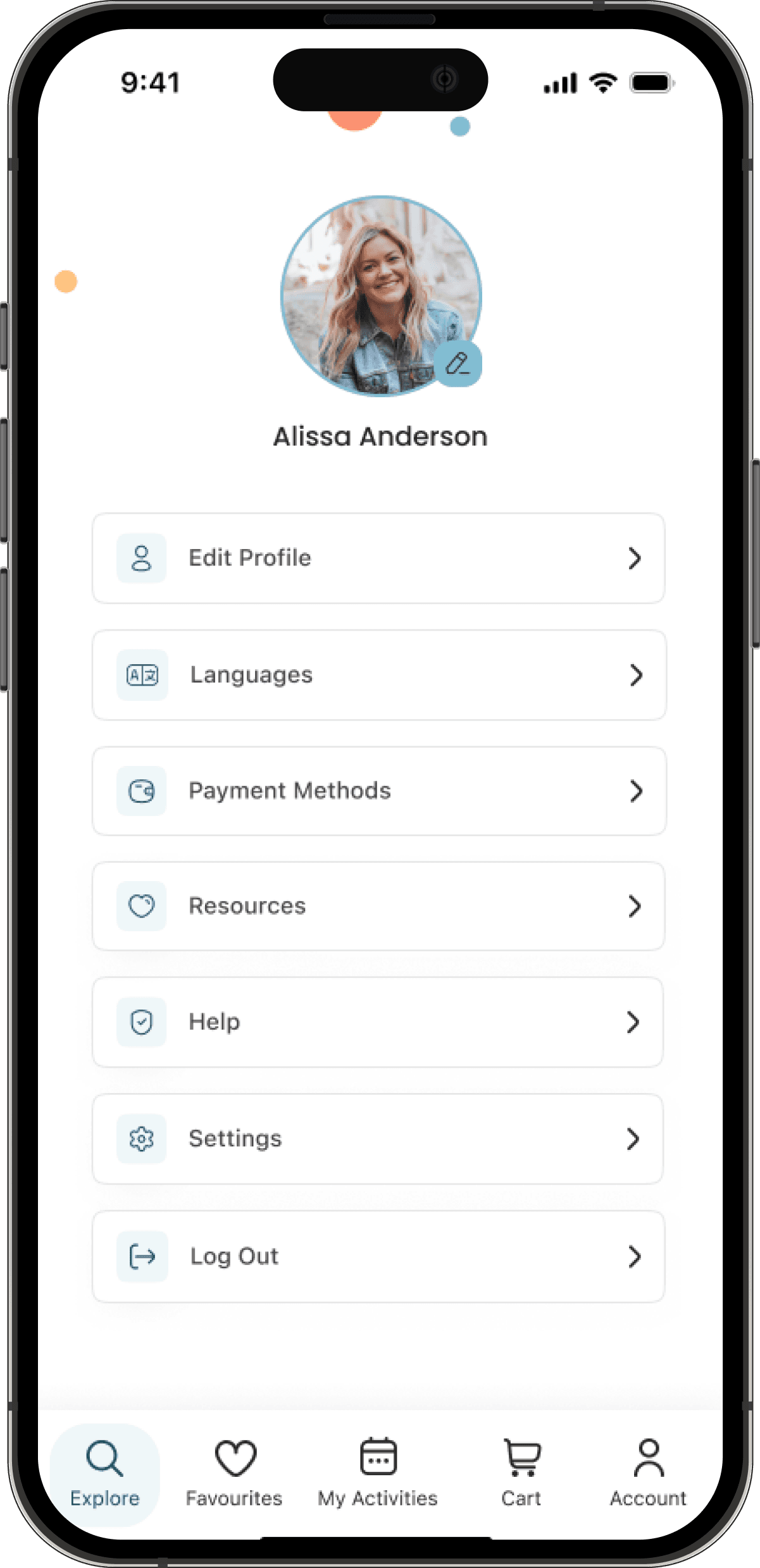
Language barriers: Parents who speak languages other than the app's primary language might face difficulties navigating and using the app. The app should offer other languages to cater to a diverse user base.



BEFORE


Finding:
Users didn’t see featured classes on this page. They suggested adding them below the search bar.
Iteration:
Featured classes were adding before clicking in the search bar
AFTER




1.1. Secondary Research
1.1. Secondary Research
1.1. Secondary Research
I started with a secondary research, and my findings revealed the following insights:
It’s increasingly common today for children to be raised in households where both parents are committed to full-time employment.
Parents face great challenges in getting enough time with children due to work obligations
Approximately 86%of mothers and 81% of fathers report that they feel rushed when caring for their children.
In order to understand their experiences, I needed to conduct primary research. Was time the only matter? Could there be something else?
1.2. Primary Research
1.2. Primary Research
1.2. Primary Research
My primary research consisted of screener surveys (quantitative research) and semi-structured interviews (qualitative research). I interviewed 5 parents with various commitments and kids aged 0 to 10.
Key Pain Points I learned:
Working parents often struggled to balance work and family commitments.
Parents with children under the age of five found it challenging to organise activities since younger children are more dependent and some activities are not appropriate for them
All the parents expressed a need for support when caring for their children.
1.3. Competitive Analysis
1.3. Competitive Analysis
1.3. Competitive Analysis
The first step was to gather data and understand parents’ needs, behaviours and pain points when looking for activities. For this, I used three research methodologies:
Secondary research
Primary research
Competitive analysis
The first step was to gather data and understand parents’ needs, behaviours and pain points when looking for activities. For this, I used three research methodologies:
Secondary research
Primary research
Competitive analysis
The first step was to gather data and understand parents’ needs, behaviours and pain points when looking for activities. For this, I used three research methodologies:
Secondary research
Primary research
Competitive analysis
My Design Process
My Design Process
My Design Process
My Role
My Role
User Research,Visual design, Prototyping & Testing
User Research,Visual design, Prototyping & Testing
Team
Team
Solo (with Feedback
from mentor)
Solo (with Feedback from mentor)
The Tools
The Tools
Figma, Miro,
Pen & Paper
Figma, Miro, Pen & Paper


01
01
Research phase
Research phase


Analysis Summary: This analysis revealed a lack of comprehensive activity options for younger children other than classes and clubs. DOWTK provided established attractions and Kids Pass activities covered by their discount programs, Happity and Club Hub only focused on specific types of activities. Further, there was a lack of filters to accommodate parents' and children’s needs.
Analysis Summary: This analysis revealed a lack of comprehensive activity options for younger children other than classes and clubs. DOWTK provided established attractions and Kids Pass activities covered by their discount programs, Happity and Club Hub only focused on specific types of activities. Further, there was a lack of filters to accommodate parents' and children’s needs.
Busy Chris: A working dad who seeks convenient and trustworthy experiences for his daughter.
Busy Chris: A working dad who seeks convenient and trustworthy experiences for his daughter.
Busy Chris: A working dad who seeks convenient and trustworthy experiences for his daughter.
Active Laura: A stay-at-home mum who desires diverse and educational experiences for her child.
Active Laura: A stay-at-home mum who desires diverse and educational experiences for her child.
Active Laura: A stay-at-home mum who desires diverse and educational experiences for her child.


To see on Miro, click here
To see on Miro, click here
To view the user flow, click here
To view the user flow, click here
To view the full sketches, click here
To view the full sketches, click here
To view the wireframes, click here
To view the wireframes, click here
To view the mockups before iterations, click here
To view the mockups before iterations,
To view my final mockups, click here
To view my final mockups, click here


03
03
IDEATION phase
IDEATION phase
02
DEFINE phase

















04
04
PROTOTYPE, TEST
& Iteration PHASES
PROTOTYPE, TEST
& Iteration PHASES
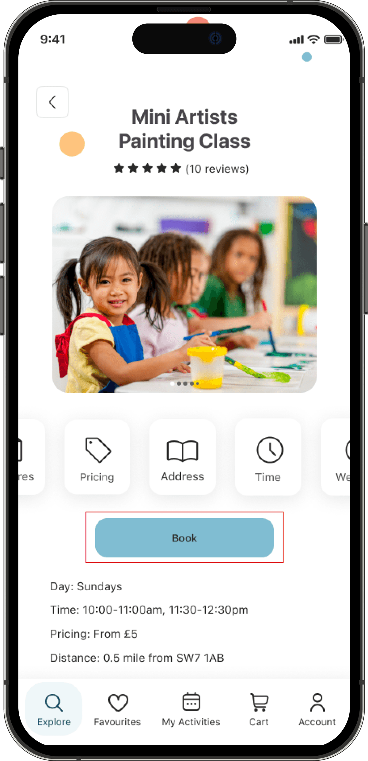
BEFORE

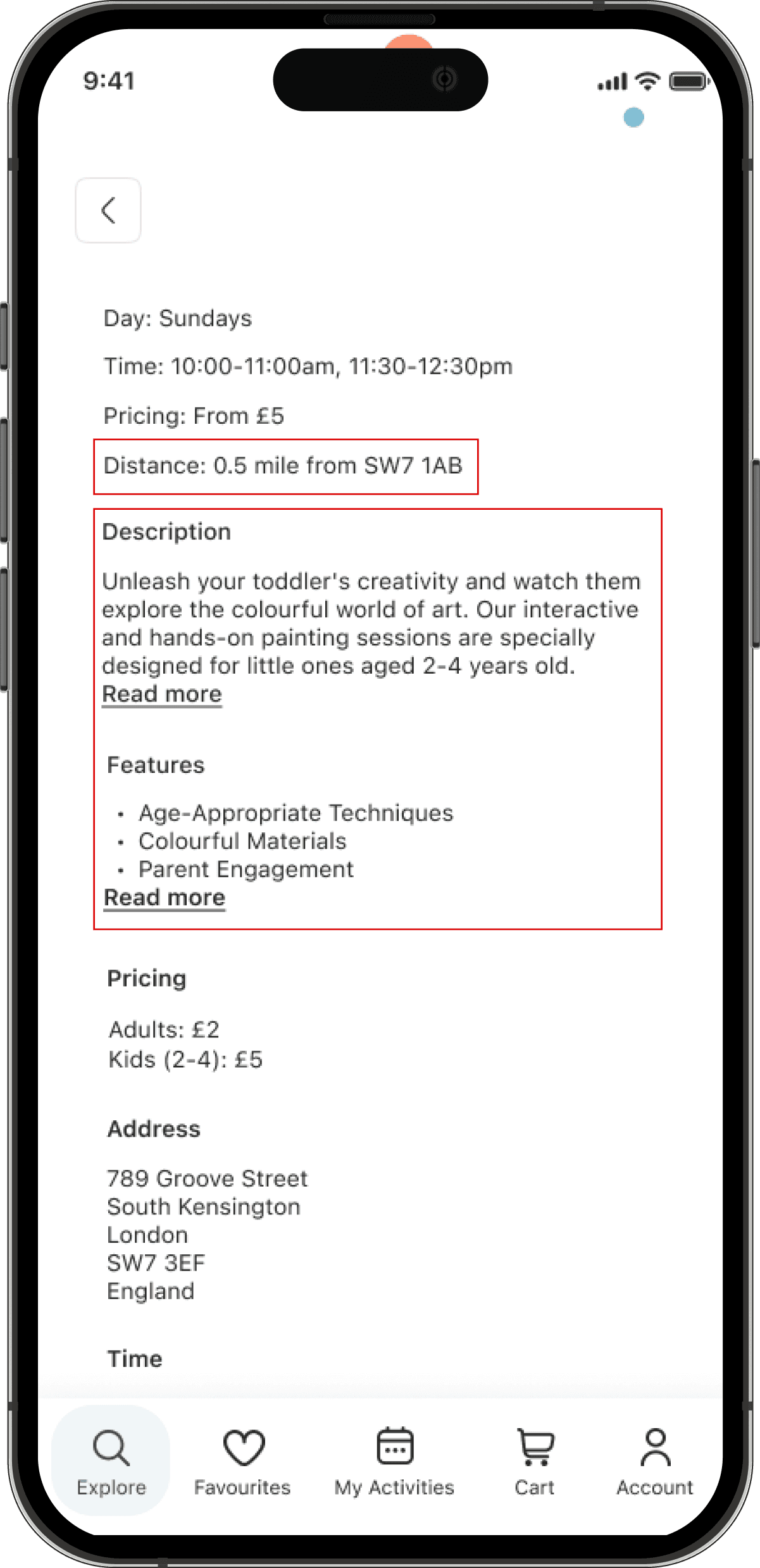

Finding:
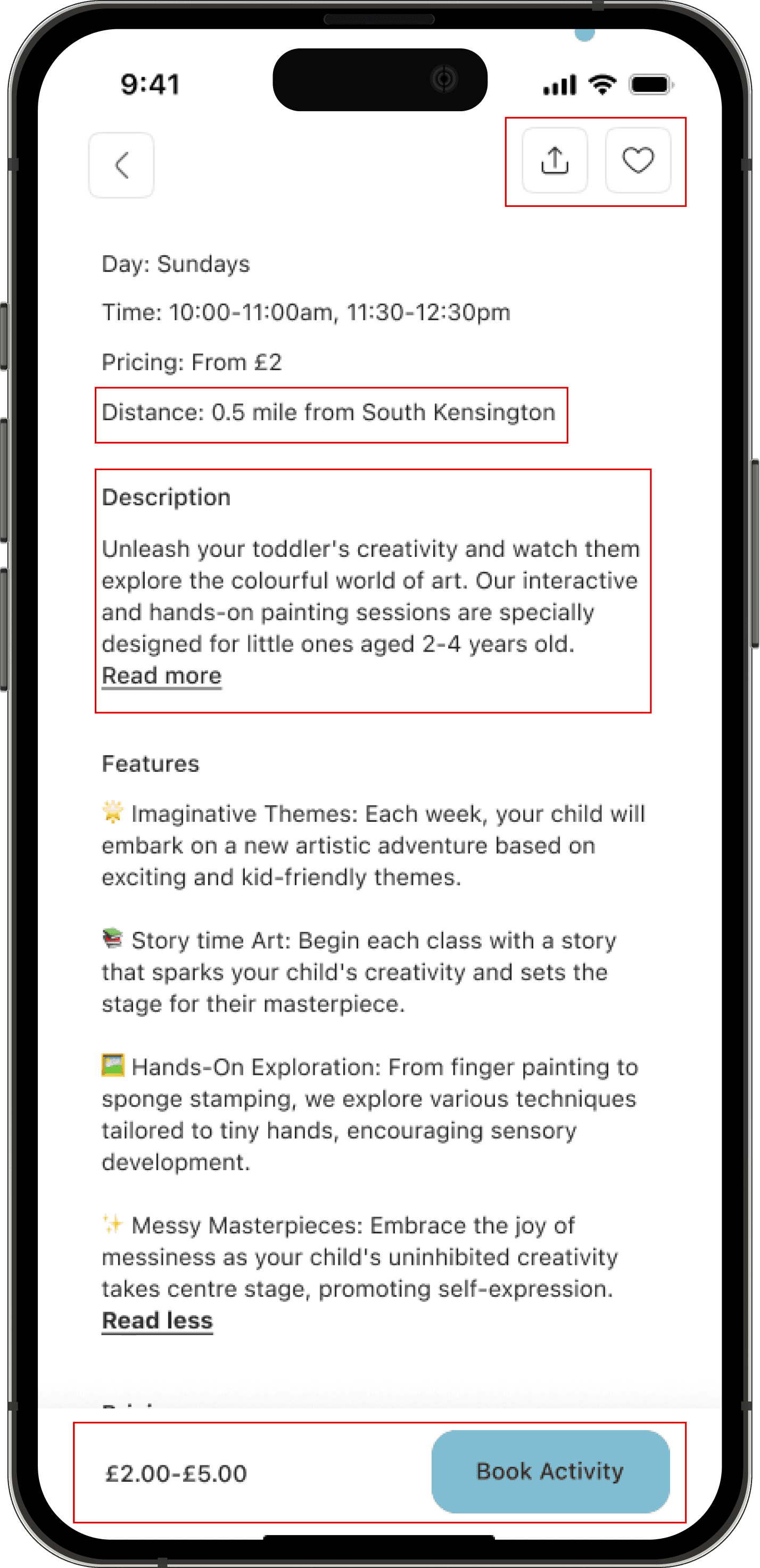
Users had to scroll up to access the book button on the activity page. There wasn’t a favourite button on this page . There was a postcode representing the user’s address, this was never entered when testing the screens
Iteration:
A book button was added to the navigation bar
The “read more” text was made interactive
The favourite icon was added to this page
The postcode was replaced with “South Kensington”
AFTER
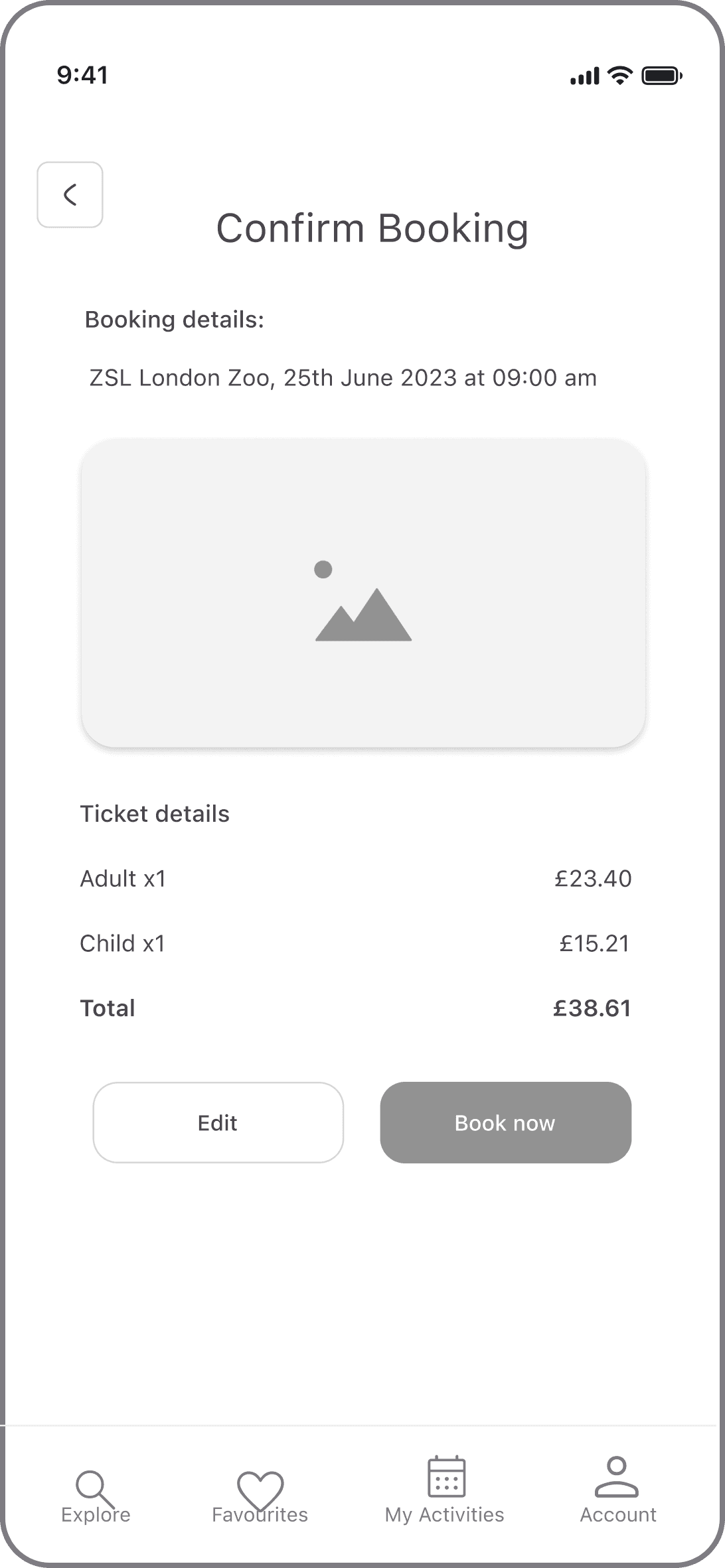
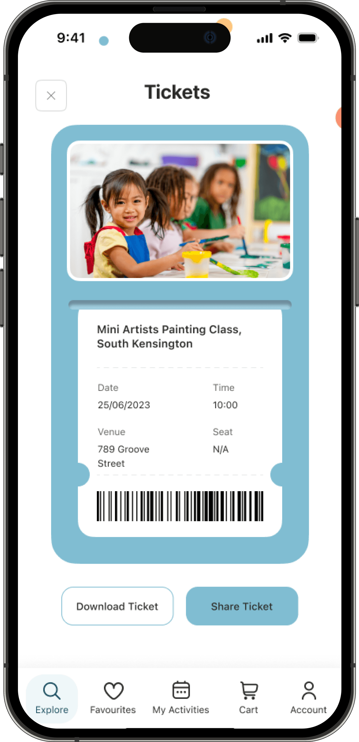
Checkout Page:
BEFORE
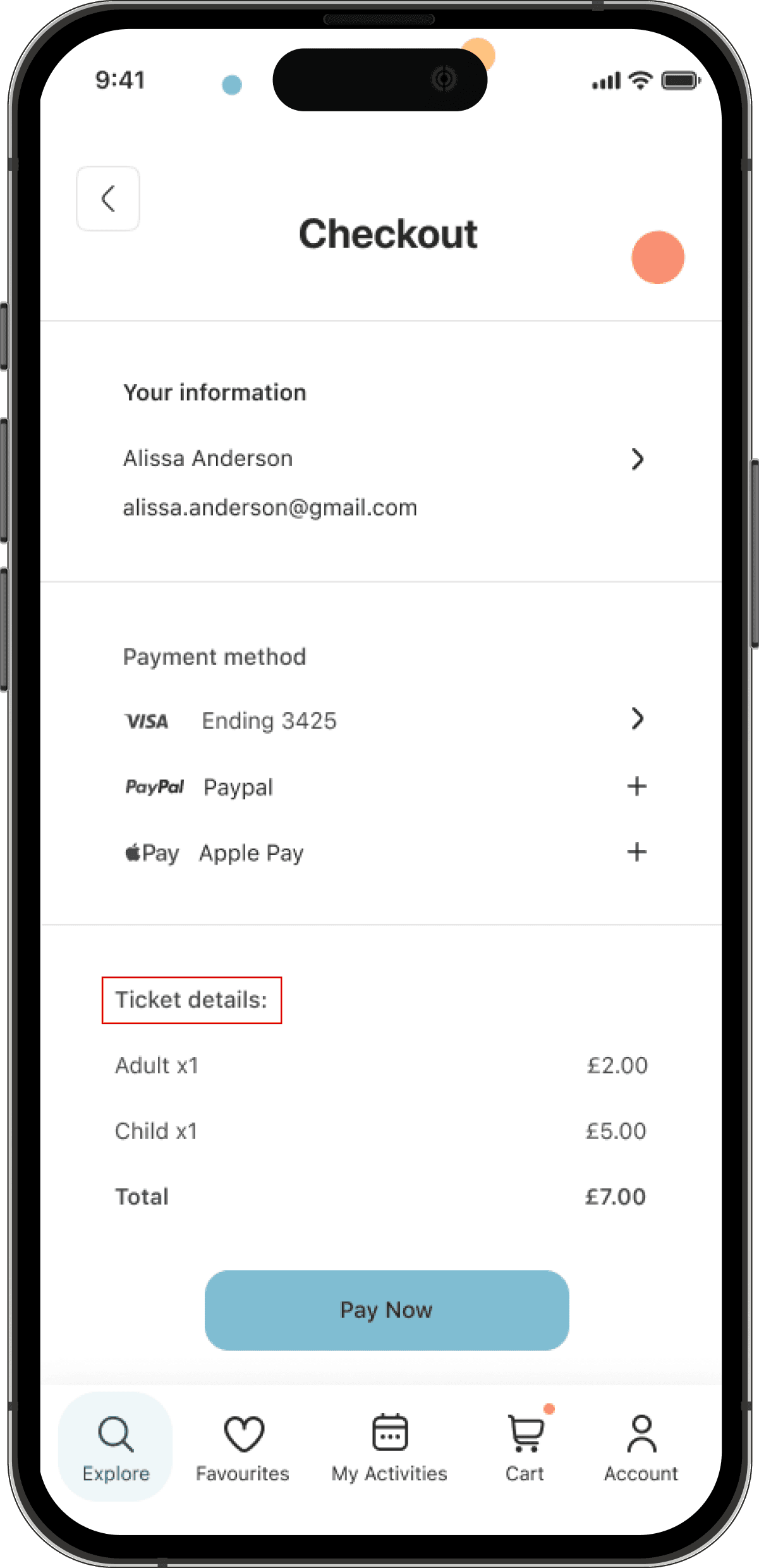

Finding:
On the booking review page, the date, time, and activity name were missing
Iteration:
The checkout page was updated to include the date, time and activity name
AFTER


More projects
More projects
© 2024 Benita Tamò
01
Research phase
03
ideation phase


Booking Flow: one user mentioned that the booking process was too long. There were too many screens before booking the activity.
Usability Challenges: some of the back buttons weren’t working which confused users
Interaction: A couple of users didn’t know how to go past the results page. The activity name wasn’t interactive, but the picture was.
3.4.3. Guerrilla Testing - Iterations
When translating my sketches into wireframes, I made iterations to address the identified usability and accessibility issues. The goal was to refine the app's design based on user feedback, ensuring a more intuitive user experience.
Booking Flow: Building on user feedback, I removed the screens prompting users to create a child’s profile before booking an activity. This helped minimise steps and enhance the overall convenience for users
Usability Challenges: I ensured all the back and exit buttons were added correctly. I also simplified these buttons to make them more intuitive and easy recognisable (the wording “back” was changed to a back icon)
Interaction: While creating my prototype later in the process, I ensured the results page was interactive, allowing users to move to the following page.



Reflection
As the sole UX designer on FunFind, this journey has been an incredible learning experience, filled with highs, lows, and growth. When I picked this project, I was excited to create a product that would help parents spend quality time with their children and create beautiful memories. Life is too short to miss those precious moments! Going through the process was at times challenging but it was fun creating something from scratch and seeing it unfold as I worked on it. At the end of the project, the positive feedback from parents made it all so worth it, more than just learning a course.
Looking back:
* I wish I had focused more on accessibility to ensure that the app could be used by more parents, regardless of their skills and abilities
* Testing was also a good learning experience for me. It helped me see problems that I would have never noticed without it.
As I’m closing this project, I’m moving forward with a new passion for user experience design. I’m taking with me the valuable lessons I’ve learned and I’m excited to create more meaningful experiences for people.
04
PROTOTYPE, TEST
& Iteration PHASES
Reflection
As the sole UX designer on FunFind, this journey has been an incredible learning experience, filled with highs, lows, and growth. When I picked this project, I was excited to create a product that would help parents spend quality time with their children and create beautiful memories. Life is too short to miss those precious moments! Going through the process was at times challenging but it was fun creating something from scratch and seeing it unfold as I worked on it. At the end of the project, the positive feedback from parents made it all so worth it, more than just learning a course.
Looking back:
* I wish I had focused more on accessibility to ensure that the app could be used by more parents, regardless of their skills and abilities
* Testing was also a good learning experience for me. It helped me see problems that I would have never noticed without it.
As I’m closing this project, I’m moving forward with a new passion for user experience design. I’m taking with me the valuable lessons I’ve learned and I’m excited to create more meaningful experiences for people.
More projects
02
DEFINE phase
02
DEFINE phase


Timeline: March - August 2023
UX/UI Case Study
Tool: Figma
Explore Screen


Results Screen


Filter Screen


3.7. Edge Cases
Search for a specific activity: Parents may wish to enter an activity name rather than a location or postcode. The search bar was adapted to allow parents to search by location, postcode, or activity name.


Language barriers: Parents who speak languages other than the app's primary language might face difficulties navigating and using the app. The app should offer other languages to cater to a diverse user base.


3.6.2. High Fidelity Mockups
Using the visual design, I then moved on to create high fidelity mockups. On the explore screen, I changed the visual to include larger pictures for activity categories and more text space. On the results page, I improved the card layout to show more activities while scrolling. Additionally, I adjusted the text colour to a darker shade to guarantee improved readability.
Explore Screen


Results Screen


Filter Screen


3.6.2. High Fidelity Mockups
Using the visual design, I then moved on to create high fidelity mockups. On the explore screen, I changed the visual to include larger pictures for activity categories and more text space. On the results page, I improved the card layout to show more activities while scrolling. Additionally, I adjusted the text colour to a darker shade to guarantee improved readability.
Explore Screen


Results Screen


Filter Screen


3.7. Edge Cases
Search for a specific activity: Parents may wish to enter an activity name rather than a location or postcode. The search bar was adapted to allow parents to search by location, postcode, or activity name.


Language barriers: Parents who speak languages other than the app's primary language might face difficulties navigating and using the app. The app should offer other languages to cater to a diverse user base.


Checkout Page:
AFTER


BEFORE


Finding:
On the booking review page, the date, time, and activity name were missing
Iteration:
The checkout page was updated to include the date, time and activity name
BEFORE


Finding:
Users had to scroll up to access the book button on the activity page. There wasn’t a favourite button on this page . There was a postcode representing the user’s address, this was never entered when testing the screens
Iteration:
A book button was added to the navigation bar
The “read more” text was made interactive
The favourite icon was added to this page
The postcode was replaced with “South Kensington”
AFTER

© 2024 Benita Tamò
