PROJECT OVERVIEW
PROJECT OVERVIEW
Damai is an eco-friendly furniture brand that is looking to improve their online browsing and checkout processes to increase online sales.
Damai is an eco-friendly furniture brand that is looking to improve their online browsing and checkout processes to increase online sales.
01
01
INTRODUCTION
INTRODUCTION
Problem
Their Product Manager shared the following data:
Their Product Manager shared the following data:
High website drop-offs: 50% of users abandon the website due to difficulty finding the right products.
High website drop-offs: 50% of users abandon the website due to difficulty finding the right products.
Low online sales: 70% of users leave their basket without purchasing, potentially due to the need for account creation before buying.
Solution
I introduced the following features to improve user experience and reduce drop-off rates:
I introduced the following features to improve user experience and reduce drop-off rates:
I introduced the following features to improve user experience and reduce drop-off rates:
Trust signals: I implemented trust signals such as live chats, media mentions, testimonials, limited-time offers and information on company values and production processes to build trust and encourage purchases.
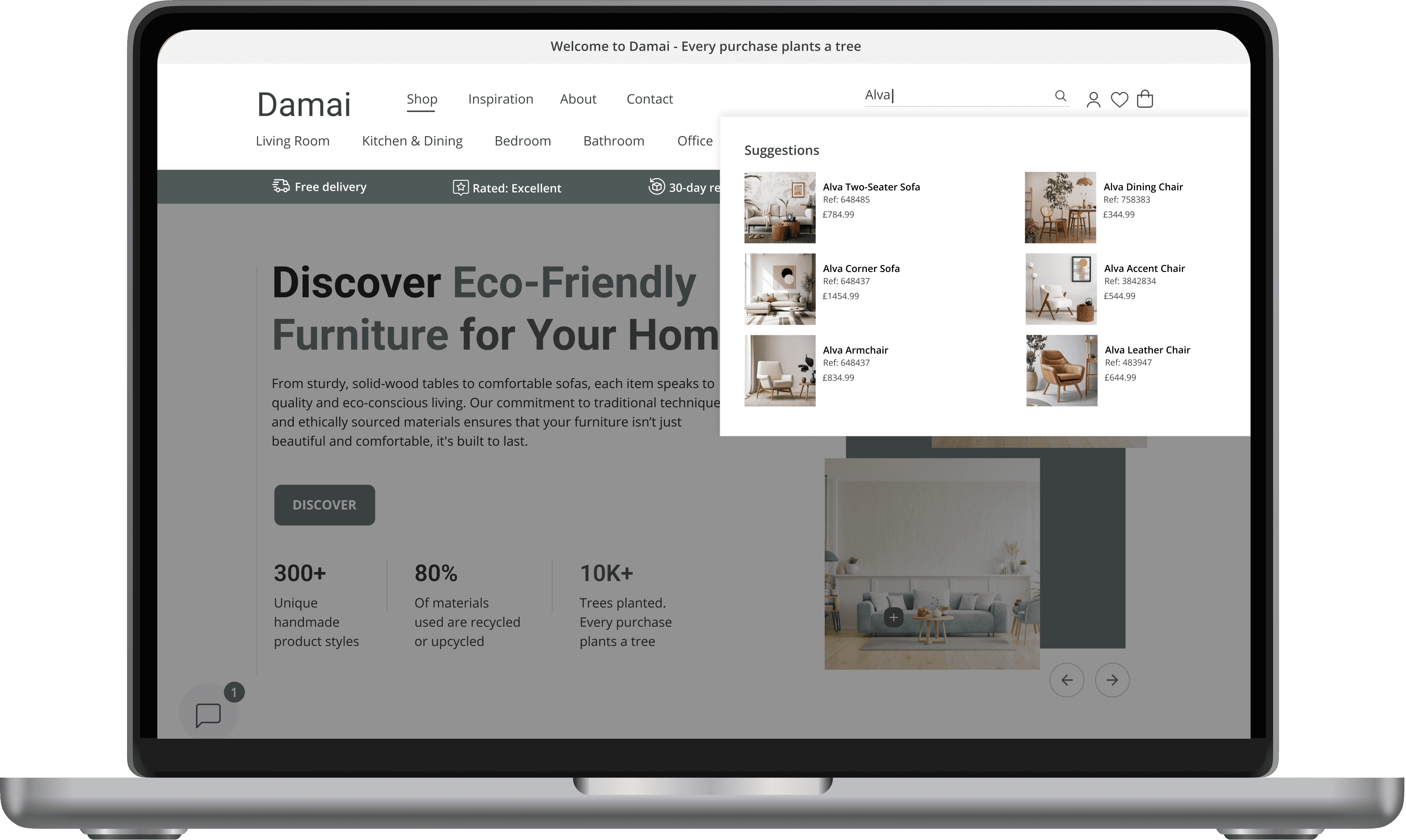
Menu Categorisation and Search Suggestions: I created a clear menu structure for users to navigate to categories, sub-categories and collections. This allows them to easily find and purchase products.
Related Product Features: I added “You may also like”, “More from this collection” and “Shop the look” sections to show items similar in style, function, or belonging to the same collection.
Easy Guest Checkout: I simplified the checkout process by adding a guest checkout option and creating a one-page checkout process.
Multiple Payment Options: I prioritised the visibility of multiple payment options on all product pages to allow easy payments
My Role
My role as a Product Designer included conducting secondary research, creating a user flow and wireframes, developing high-fidelity mockups, and conducting all usability testing
Trust signals: I implemented trust signals such as live chats, media mentions, testimonials, limited-time offers and information on company values and production processes to build trust and encourage purchase.
Menu Categorisation and Search Suggestions: I created a clear menu structure for users to navigate to categories, sub-categories and collections. This allows them to easily find and purchase products.
Related Product Features: I added “You may also like”, “More from this collection” and “Shop the look” sections to show items similar in style, function, or belonging to the same collection.
Related Product Features: I added “You may also like”, “More from this collection” and “Shop the look” sections to show items similar in style, function, or belonging to the same collection.
Easy Guest Checkout: I simplified the checkout process by adding a guest checkout option and creating a one-page checkout process.
Easy Guest Checkout: I simplified the checkout process by adding a guest checkout option and creating a one-page checkout process.
Multiple Payment Options: I prioritised the visibility of multiple payment options on all product pages to allow easy payment.
My Role
My role as a Product Designer included conducting secondary research, creating a user flow and wireframes, developing high-fidelity mockups, and conducting all usability testing.
View Original File
02
02
project plan
project plan
Project Framework
Project Framework
I used the following project framework:
I used the following project framework:
Project Plan
project
03
PHASE 1: DISCOVER
Comparative Analysis
I started my research by looking at some of the top Furniture brands: Wayfair, Daals, Sklum and Nkuku. Then I did a comparative analysis to understand their browsing and checkout processes:
Literature Review
After doing a comparative analysis, I followed it up with thorough research to gain a better understanding of the reasons why e-commerce website visitors drop off and abandon their checkouts. Given the time constraints of the project, I opted to conduct a literature review. Here are the key findings from my research:
Why Users Abandon a Website or Items in a Cart:
PHASE 2: DESIGN
User Flow
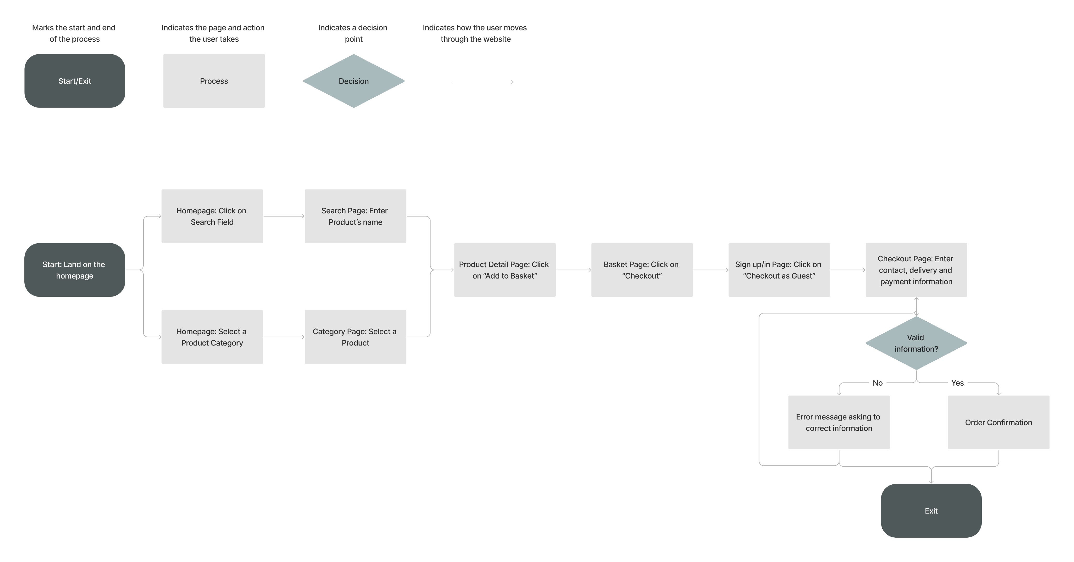
Now that I had a better understanding of the issues faced by users, I moved on to the next phase and developed a user flow. This flow includes a guest checkout and users are required to only fill out one page with the most crucial fields. This approach reduces the number of fields that users need to complete, making the checkout process more straightforward.
Wireframes
I also designed mid-fidelity wireframes. The goal was for the wireframes to be detailed so I could gather as many feedback as possible and do iterations when working on the high-fidelity mockups:
View Full Wireframes
PHASE 3: VALIDATE
PHASE 3: VALIDATE
Usability Testing
Usability Testing
The first round of testing was completed remotely with 5 participants. Here are some positive quotes from users:
The first round of testing was completed remotely with 5 participants. Here are some positive quotes from users:
PHASE 4: DESIGN
PHASE 4: DESIGN
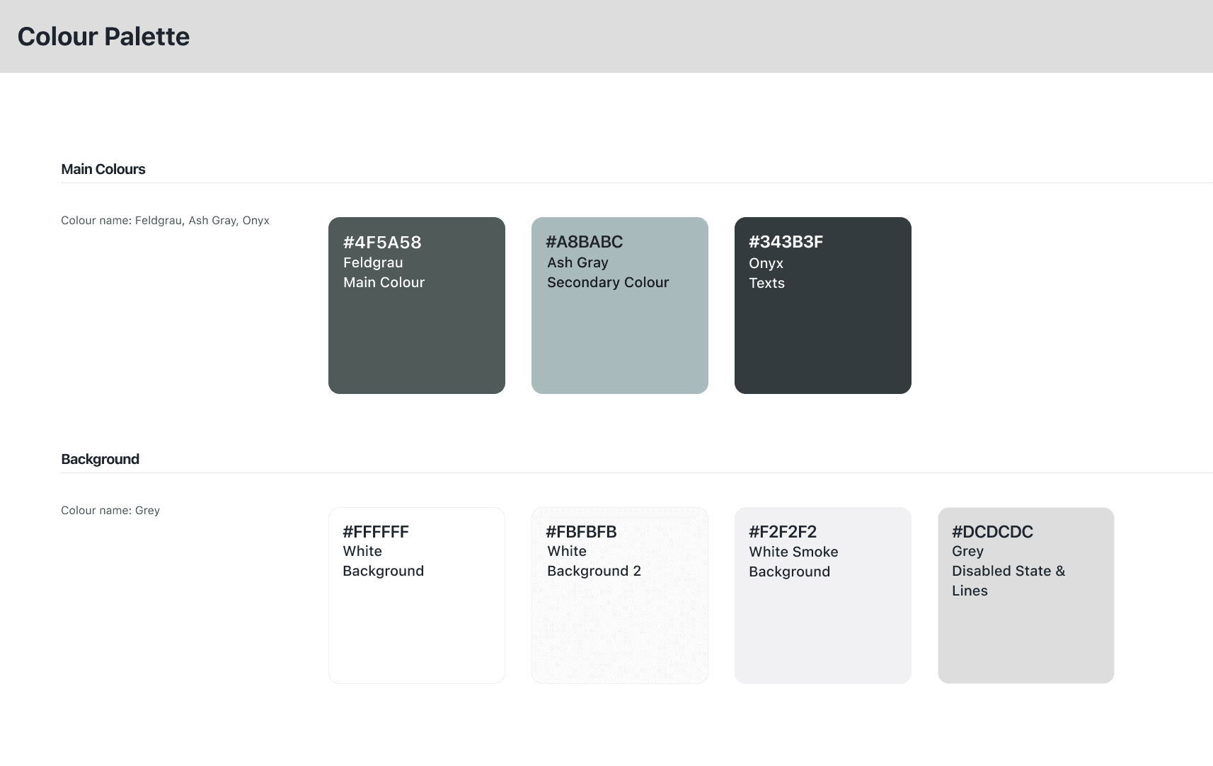
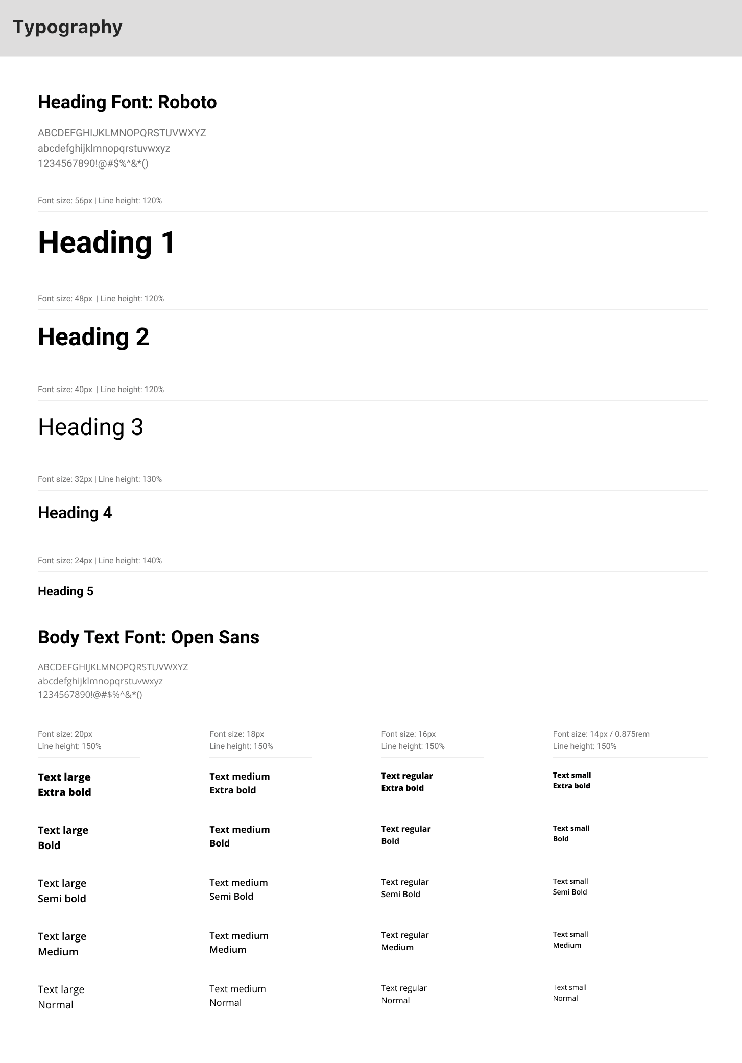
Style Guide
Style Guide
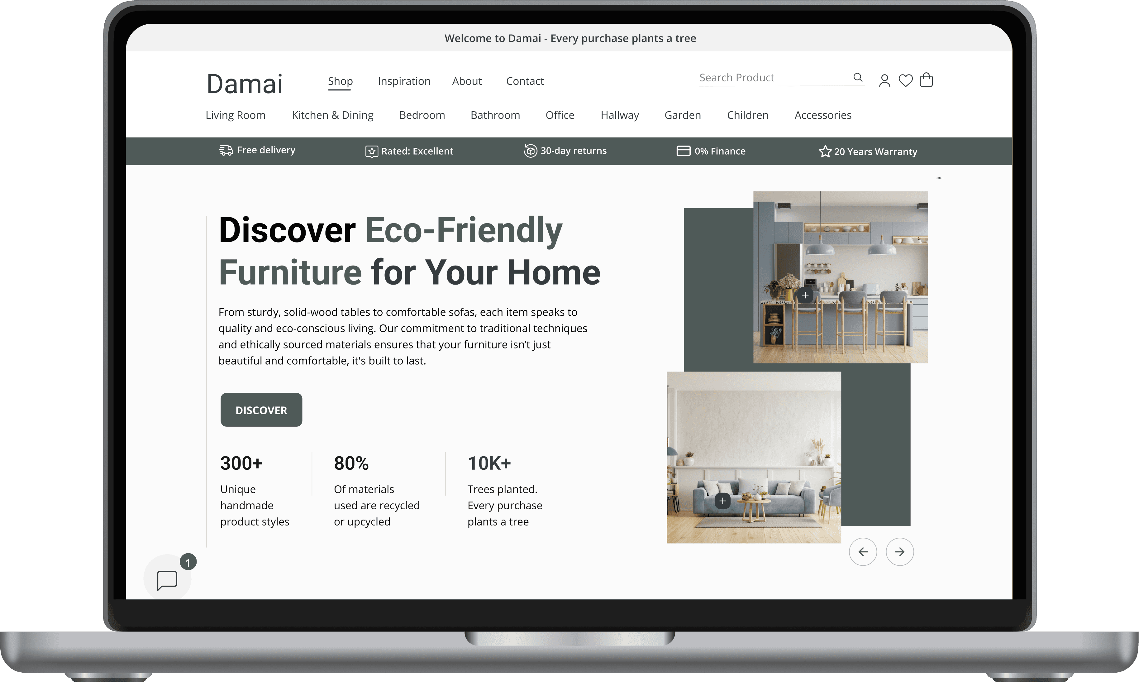
Homepage
New search screen
New search screen

The tests also revealed the following:
The tests also revealed the following:
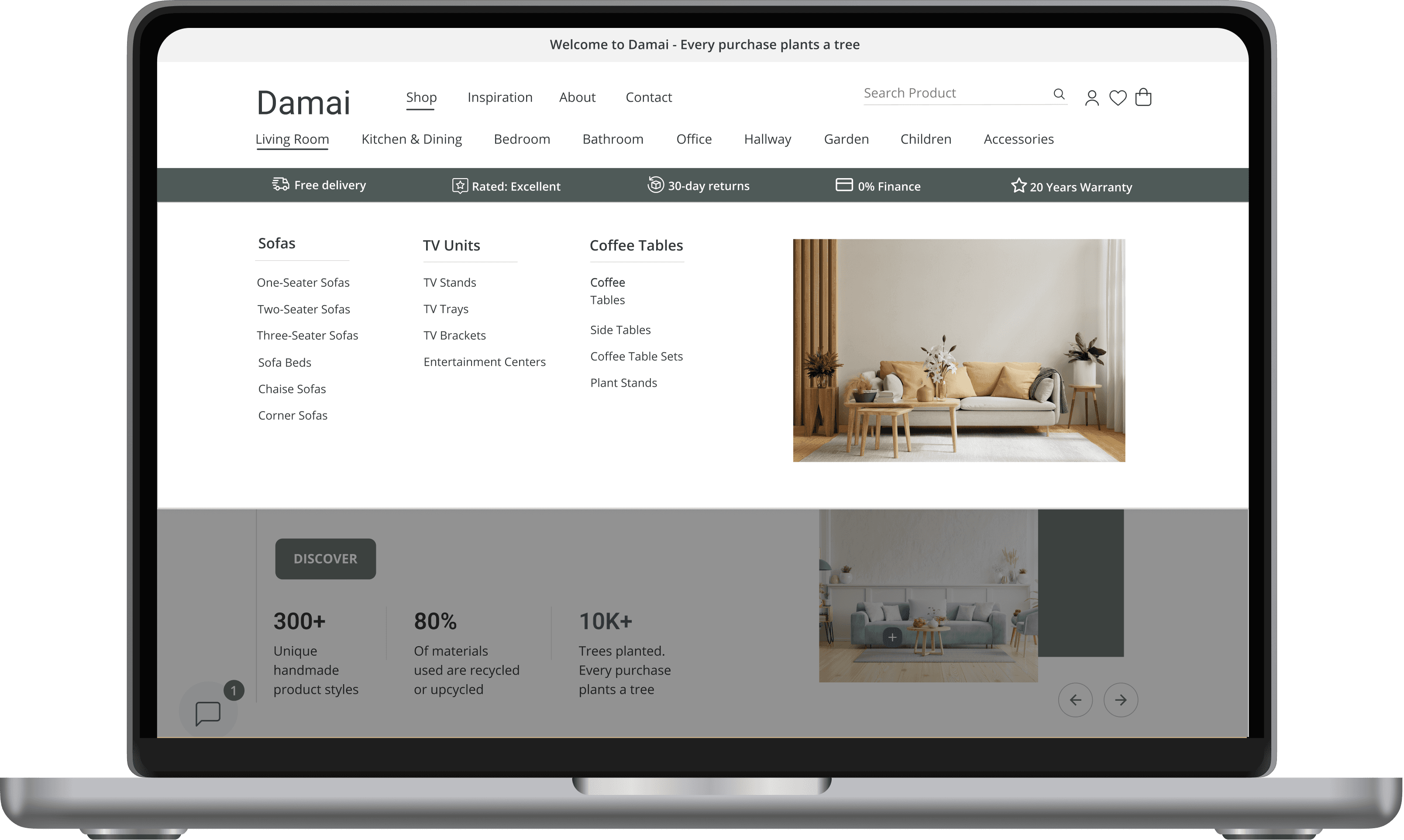
Category Page: Users expected to see a room category, which would have sofas and chairs in it as sub-categories
Category Page: Users expected to see a room category, which would have sofas and chairs in it as sub-categories
Product Detail Page: A user noticed that the navigation arrows were missing from the main picture
Product Detail Page: A user noticed that the navigation arrows were missing from the main picture
Product Detail Page: A user noticed that the navigation arrows were missing from the main picture
Checkout Flow: A user found the checkout flow long and time consuming
Checkout Flow: A user found the checkout flow long and time consuming
Homepage: Users wanted to do a search via the search field, this wasn’t available in my prototype
Homepage: Users wanted to do a search via the search field, this wasn’t available in my prototype
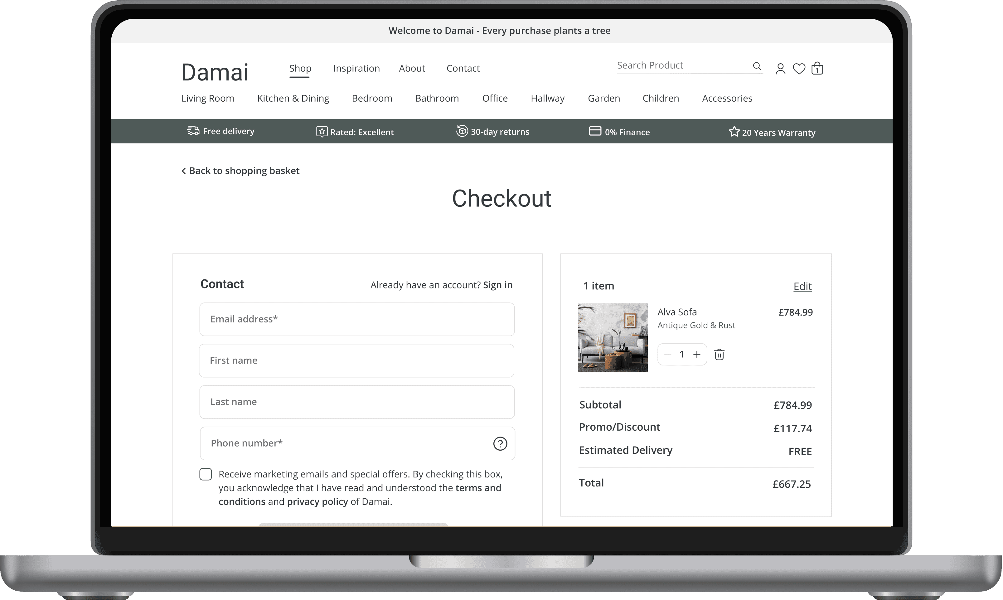
Confirmation Page: Users found it confusing that they had to enter their friend’s email address to send a referral link
Confirmation Page: Users found it confusing that they had to enter their friend’s email address to send a referral link
Confirmation Page: Users found it confusing that they had to enter their friend’s email address to send a referral link
Category Page
The first category is "Sofas and Chairs"
The first category: "Sofas and Chairs"


"Sofas and Chairs" is changed to "Living Room"
"Sofas and Chairs changed to "Living Room"

Product Detail Page
Arrows are missing from the main picture
Arrows are missing from the picture
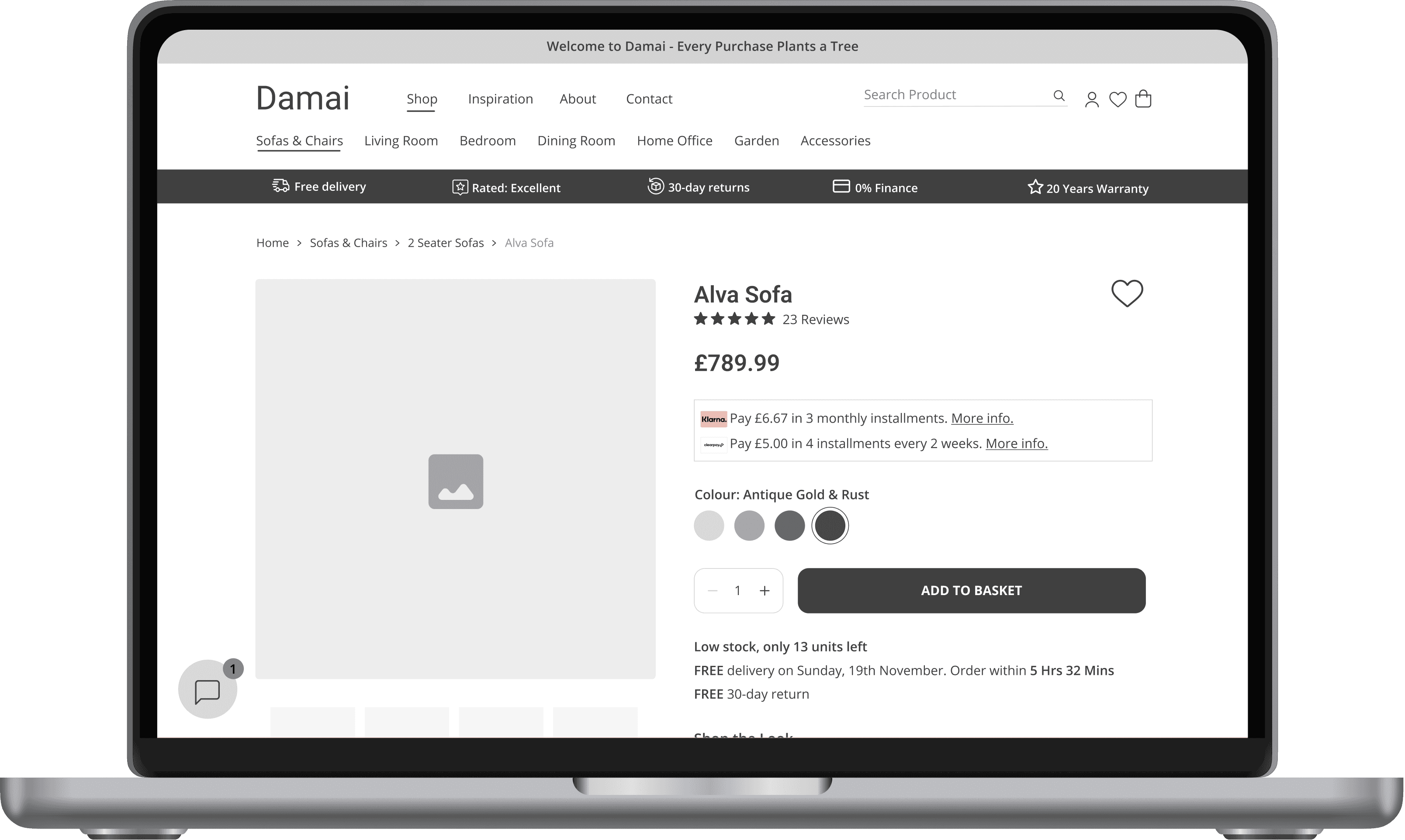

An arrow is added on each side of the picture
An arrow is added on each side of the picture


Checkout Flow
Multiple checkout pages
Multiple checkout pages


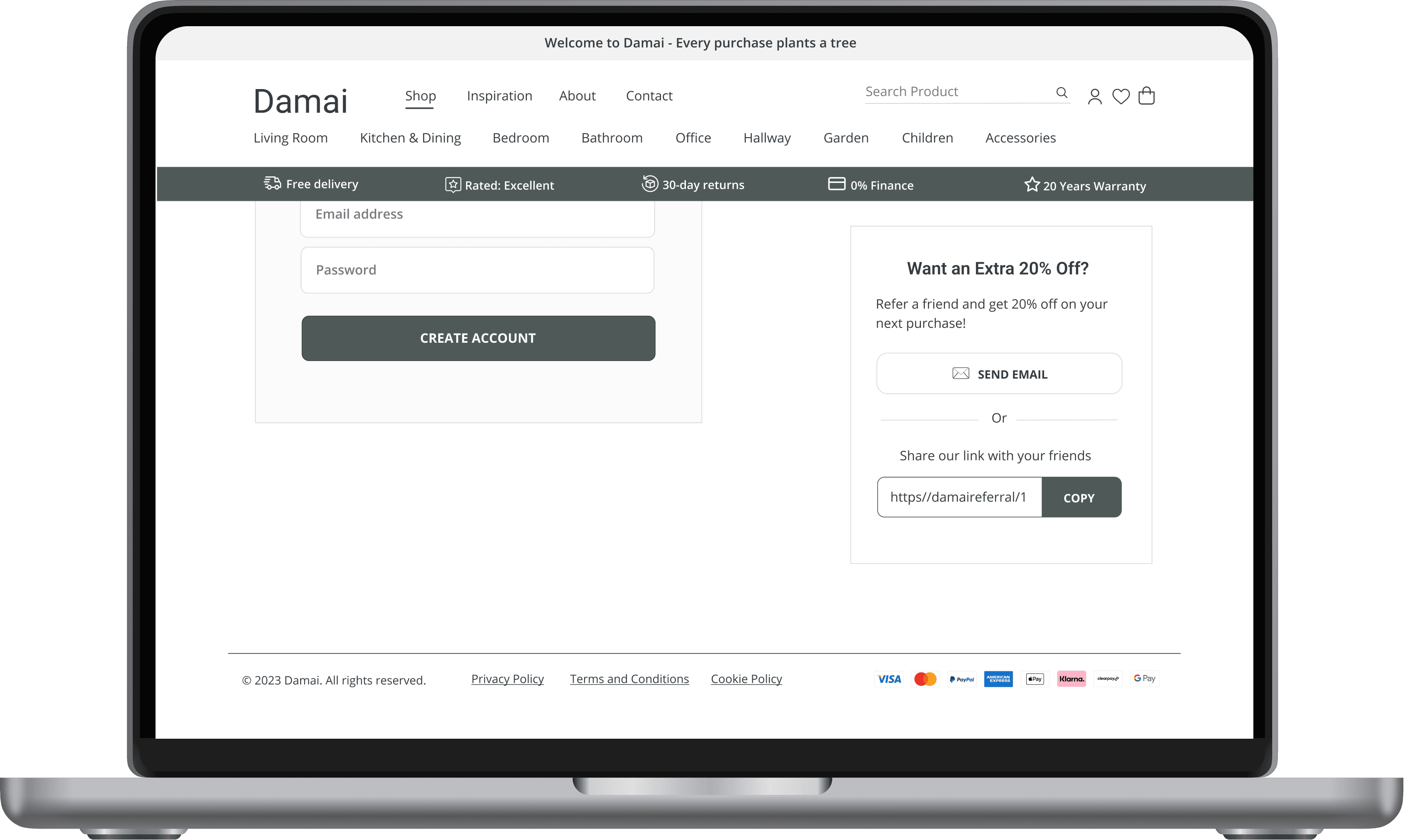
One checkout page
One checkout page

Confirmation Page: Referrals
Users must enter their own email address & friend’s email address
Users must enter their own email address & friend’s email address


They can click on “Send email” and will be redirected to a mailbox to send an email
They can click on “Send email” and will be redirected to a mailbox to send an email

High-Fidelity Mockups
High-Fidelity Mockups
Keeping in mind the feedback I had received, I moved on to create high-fidelity mockups and made the following changes:
Keeping the feedback I had received in mind, I moved on to create high-fidelity mockups and made the following changes:
Homepage: I created an additional screen for users to test the search field
Category Page: I changed the “sofas and chairs” category to “Living Room”
Category Page: I changed the “sofas and chairs” category to “Living Room”
Category Page: I changed the “sofas and chairs” category to “Living Room”
Product Detail Page: I added a navigation arrow on each side of the main picture for users to scroll through pictures
Product Detail Page: I added a navigation arrow on each side of the main picture for users to scroll through pictures
Product Detail Page: I added a navigation arrow on each side of the main picture for users to scroll through pictures
Checkout Flow: I re-designed the checkout flow and changed it from a multiple-page to a one-page checkout
Confirmation Page: I simplified the referral process to a CTA email button and a referral link
Confirmation Page: I simplified the referral process to a CTA email button and a referral link
Confirmation Page: I simplified the referral process to a CTA email button and a referral link



Prototype
PHASE 5: VALIDATE
Usability Testing
I completed the final usability testing with a new group of 5 users. The sessions were done remotely and my goal was to test the redesigned product discovery path and the new checkout flow to ensure they met user needs and expectations.
Outcome
Intuitive Navigation: Participants found the new navigation intuitive and user-friendly
Positive Checkout Experience: The reduction in steps was well-received.
Positive Checkout Experience: The reduction in steps was well-received.
Overall Success: All users were able to effortlessly browse, add products to the cart, and proceed through the checkout process. Overall the last round was a success.
Overall Success: All users were able to effortlessly browse, add products to the cart, and proceed through the checkout process. Overall the last round was a success.
project STEPS
04
Moving forward, I’d like to work on the following:
Accessible Design: Continue working on accessibility so that the website is accessible to all users, including those with disabilities. This means adding alternative texts for images and ensuring all interactive elements such as menus and buttons can be controlled using the keyboard.
Comparison Feature: My goal is to also implement a comparison feature on the product detail and basket page for users to compare products based on their features and sizes.
Question and Answer section: This section would be available on the product detail page and would allow users to ask questions about the product to help them make informed decisions. Other users would also view these questions and answers to assist them with their purchase decisions.
REFLECTION
05
As I reflect on this project, one thing that made my work easier was prioritising a seamless navigation experience for users. I did this by spending more time working on interactive wireframes that closely resembled the final website's look and feel. This approach allowed users to better understand the website's content and flow during the first usability tests. It also helped me obtain valuable feedback that I later incorporated into the high-fidelity mockups, which led to an overall improvement in user satisfaction.
The main challenge I had was creating a checkout flow that was simple yet effective while capturing all the required information from users. It took a few iterations and user testing to get to an optimal flow. However, it was an invaluable experience that taught me the importance of testing and involving users in the design process.
This was the first website I designed. It was a different experience than designing mobile apps. However, I enjoyed the process and am looking forward to using the lessons I learned in future projects.
As I reflect on this project, one thing that made my work easier was prioritising a seamless navigation experience for users. I did this by spending more time working on interactive wireframes that closely resembled the final website's look and feel.
This approach allowed users to better understand the website's content and flow during the first usability tests. It also helped me obtain valuable feedback that I later incorporated into the high-fidelity mockups, which led to an overall improvement in user satisfaction.
The main challenge I had was creating a checkout flow that was simple yet effective while capturing all the required information from users. It took a few iterations and user testing to get to an optimal flow. However, it was an invaluable experience that taught me the importance of testing and involving users in the design process.
This was the first website I designed. It was a different experience than designing mobile apps. However, I enjoyed the process and am looking forward to using the lessons I learned in future projects.
Duration: October - November 2023
Product Type: E-commerce Website
Tool: Figma


I was given 90 hours to complete this project. To ensure efficient progress, I created a project plan that outlined each phase, its scope, and the corresponding timeline. The goal was to keep track of progress, facilitate stakeholder communication, and ensure timely project completion.


project
03
PHASE 1: DISCOVER
Comparative Analysis
I started my research by looking at some of the top Furniture brands: Wayfair, Daals, Sklum and Nkuku. I then did a comparative analysis to understand their browsing and checkout processes:
DAMAI CASE STUDY
DAMAI CASE STUDY
Improving E-commerce Experience from Browsing to Checkout
Improving E-commerce Experience from Browsing to Checkout
Improving E-commerce Experience from Browsing to Checkout


Low online sales: 70% of users leave their basket without purchasing, potentially due to the need for account creation before buying.
project
03
PHASE 1: DISCOVER
Comparative Analysis
I started my research by looking at some of the top Furniture brands: Wayfair, Daals, Sklum and Nkuku. I then did a comparative analysis to understand their browsing and checkout processes:
I was given 90 hours to complete this project. To ensure efficient progress, I created a project plan that outlined each phase, its scope, and the corresponding timeline. The goal was to keep track of progress, facilitate stakeholder communication, and ensure timely project completion.
I was given 90 hours to complete this project. To ensure efficient progress, I created a project plan that outlined each phase, its scope, and the corresponding timeline. The goal was to keep track of progress, facilitate stakeholder communication, and ensure timely project completion.
Literature Review
After the comparative analysis, I followed it up with thorough research to gain a better understanding of the reasons why e-commerce website visitors drop off and abandon their checkouts. Given the time constraints of the project, I opted to conduct a literature review. Here are the key findings from my research:
Why Users Abandon a Website or items in a Cart:


PHASE 2: DESIGN
User Flow
Now that I had a better understanding of the issues faced by users, I moved on to the next phase and developed a user flow. This flow includes a guest checkout and users are required to only fill out one page with the most crucial fields. This approach reduces the number of fields that users need to complete, making the checkout process more straightforward.
Wireframes
I also designed mid-fidelity wireframes. The goal was for the wireframes to be detailed so I could gather as many feedback as possible and do iterations when working on the high-fidelity mockups:
Category Page
The first category is
"Sofas and Chairs"

"Sofas and Chairs" is
changed to "Living Room"

Product Detail Page
Arrows are missing
from the main picture

An arrow is added on each side of the picture

Confirmation Page: Referrals
Users must enter their email address to send an email

They will be redirected to a mailbox to send their email

Checkout Flow
Multiple
checkout pages

One single
checkout page

View Final Prototype
Low online sales: 70% of users leave their basket without purchasing, potentially due to the need for account creation before buying.
project
03
PHASE 1: DISCOVER
Comparative Analysis
I started my research by looking at some of the top Furniture brands: Wayfair, Daals, Sklum and Nkuku. I then did a comparative analysis to understand their browsing and checkout processes:
Literature Review
After the comparative analysis, I followed it up with thorough research to gain a better understanding of the reasons why e-commerce website visitors drop off and abandon their checkouts. Given the time constraints of the project, I opted to conduct a literature review. Here are the key findings from my research:
Why Users Abandon a Website or items in a Cart:


PHASE 2: DESIGN
User Flow
Now that I had a better understanding of the issues faced by users, I moved on to the next phase and developed a user flow. This flow includes a guest checkout and users are required to only fill out one page with the most crucial fields. This approach reduces the number of fields that users need to complete, making the checkout process more straightforward.
Prototype
Outcome
Intuitive Navigation: Participants found the new navigation intuitive and user-friendly
Positive Checkout Experience: The reduction in steps was well-received.
Overall Success: All users were able to effortlessly browse, add products to the cart, and proceed through the checkout process. Overall the last round was a success.
PHASE 5: VALIDATE
Usability Testing
I completed the final usability testing with a new group of 5 users.
The sessions were done remotely and my goal was to test the redesigned product discovery path and the new checkout flow to ensure they met user needs and expectations.
project STEPS
04
Moving forward, I’d like to work on the following:
Accessible Design: Continue working on accessibility so that the website is accessible to all users, including those with disabilities. This means adding alternative texts for images and ensuring all interactive elements such as menus and buttons can be controlled using the keyboard.
Comparison Feature: My goal is to also implement a comparison feature on the product detail and basket page for users to compare products based on their features and sizes.
Question and Answer section: This section would be available on the product detail page and would allow users to ask questions about the product to help them make informed decisions. Other users would also view these questions and answers to assist them with their purchase decisions.
View Final Prototype
Confirmation Page: Referrals
Users must enter their email address to send an email

They will be redirected to a mailbox to send their email

Checkout Flow
Multiple
checkout pages

One single
checkout page

Category Page
The first category is
"Sofas and Chairs"

"Sofas and Chairs" is
changed to "Living Room"

Homepage
New search screen


© 2024 Benita Tamò
Duration: October - November 2023
Product Type: E-commerce Website
Tool: Figma
Product Detail Page
Arrows are missing
from the main picture

An arrow is added on each side of the picture

Wireframes
I also designed mid-fidelity wireframes. The goal was for the wireframes to be detailed so I could gather as many feedback as possible and do iterations when working on the high-fidelity mockups:
As I reflect on this project, one thing that made my work easier was prioritising a seamless navigation experience for users.
I did this by spending more time working on interactive wireframes that closely resembled the final website's look and feel. This approach allowed users to better understand the website's content and flow during the first usability tests.
It also helped me obtain valuable feedback that I later incorporated into the high-fidelity mockups, which led to an overall improvement in user satisfaction.
The main challenge I had was creating a checkout flow that was simple yet effective while capturing all the required information from users. It took a few iterations and user testing to get to an optimal flow.
However, it was an invaluable experience that taught me the importance of testing and involving users in the design process.
This was the first website I designed. It was a different experience than designing mobile apps. However, I enjoyed the process and am looking forward to using the lessons I learned in future projects.
let's connect!
© 2024 Benita Tamò
let's connect!
let's connect!
REFLECTION
05
